UX/UI FEATURE ENHANCEMENT
Experience and visual design refinement for Toyota's "Mini Mega Tool," a web solution for simplified vehicle pricing.
Agency
Saatchi & Saatchi
Role
Senior UX Designer
Timeframe
Two Months
Team
Creative Director
Senior UX Designer
UX Designer
Problem
Toyota aimed to enhance their vehicle pricing experience, which required significant improvement. The existing tool lacked a seamless, user-friendly design, and insights from Saatchi’s strategy team highlighted key pain points that needed to be addressed.
Solution
We implemented a refined flow and updated visual design to elevate the user experience. This process involved incorporating user feedback and conducting thorough testing to ensure the new pricing system aligned with Toyota's high standards for usability.
RESEARCH
The Saatchi research and strategy team conducted in-depth research through interviews, surveys, and data analysis to uncover challenges with the vehicle pricing tool. They identified issues like information overload, prioritized payment types, and repetitive input fields. These insights were crucial in guiding our redesign, ensuring the new design met user needs and Toyota's high standards.
Info Overload
Users felt overwhelmed by the cluttered interface, making it hard to focus and navigate. This showed the need for a more digestible layout.
Main Focus
Users were most concerned with down and monthly payments, highlighting the need to prioritize these options in the design.
Adjustment Ease
Users wanted an easier way to adjust inputs, emphasizing the need for a more flexible and user-friendly interface.
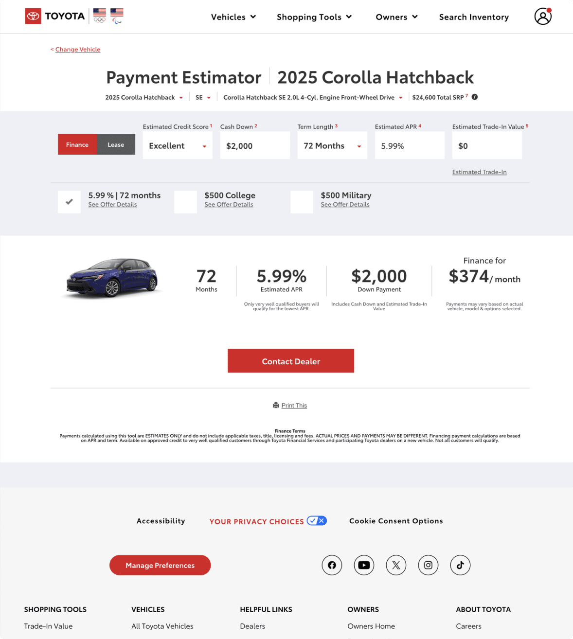
Before - The previous version of the payment estimator.
USER FLOW
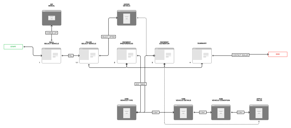
The research from the Saatchi team led us to adopt a progressive disclosure solution, which simplified the user experience by revealing information gradually. This approach addressed information overload and allowed users to focus on key tasks. To implement it, we mapped out a new user flow that introduced elements logically, ensuring a smoother interaction with the payment estimator tool.
WIREFRAMING
After building out the user flow and incorporating key elements such as offers and the Kelley Blue Book (KBB) trade-in modal, I began sketching and wireframing the design. This process helped to visualize how users would interact with the flow, ensuring a smooth experience while balancing promotional offers and the trade-in feature.
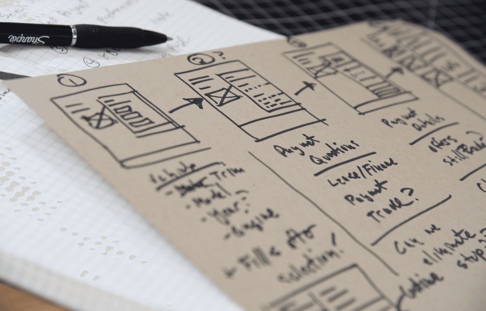
Sketching LOFI Wires
I began sketching layouts while working content into the designs to ensure key elements fit together seamlessly. This allowed me to experiment with visual arrangements and test content flow before moving into digital wireframing.
Digital Wireframing
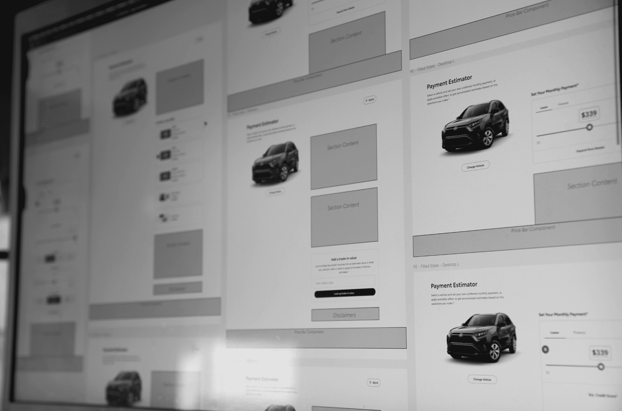
After completing the sketches, I transitioned into digital wireframing to refine the layout with more precision and structure. This step allowed for the integration of key elements, ensuring content and functionality aligned smoothly. I also utilized components from our design system, which sped up the process and ensured consistency across the design.
DESIGN SYSTEM
Ellipse
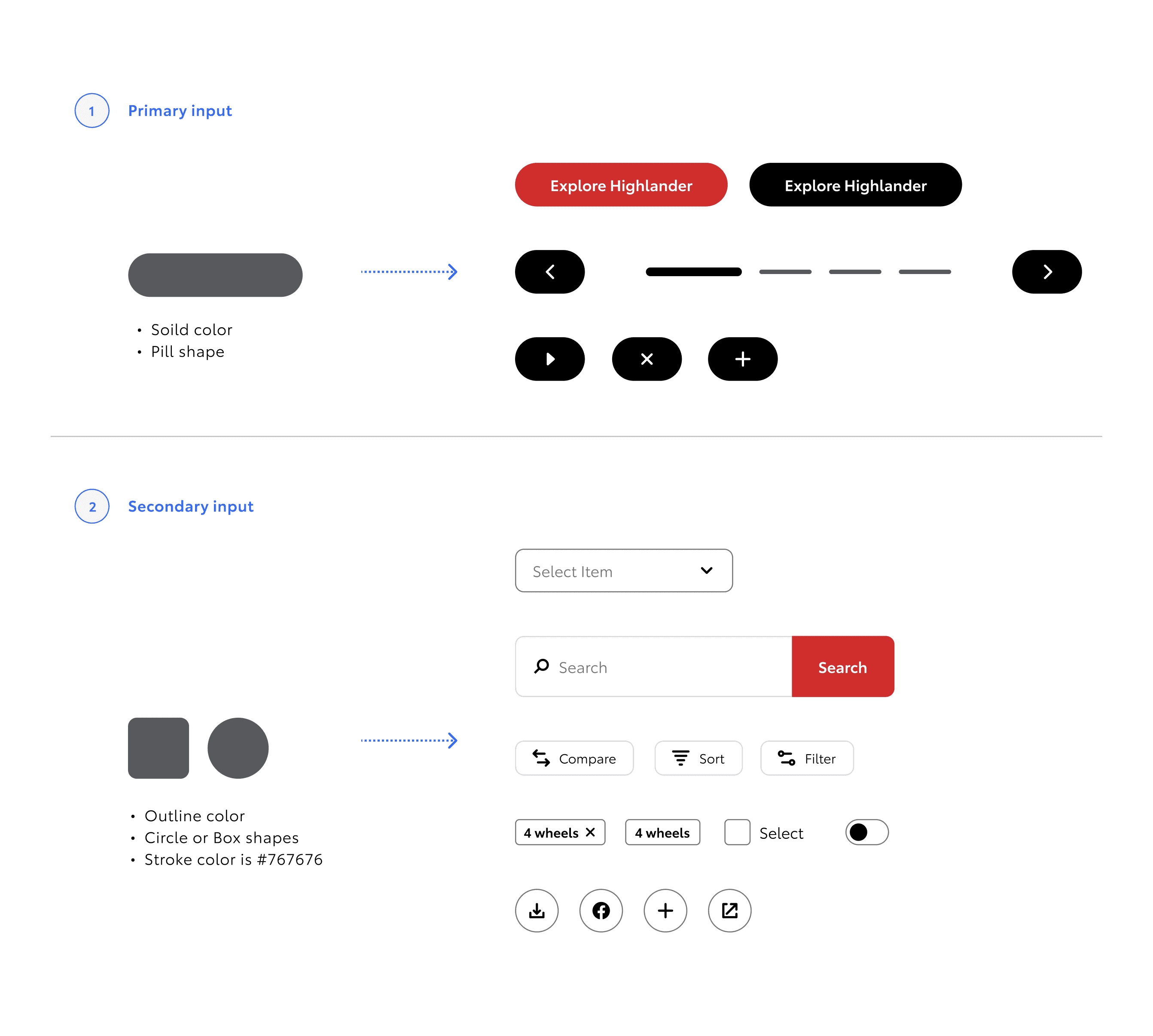
I integrated the Ellipse design system, which I was a team member of, into the wireframes. This ensured design consistency across the project.
Design System Advocacy
I actively advocated for the adoption of the Ellipse design system, helping to formalize processes.
Structure & Procedure
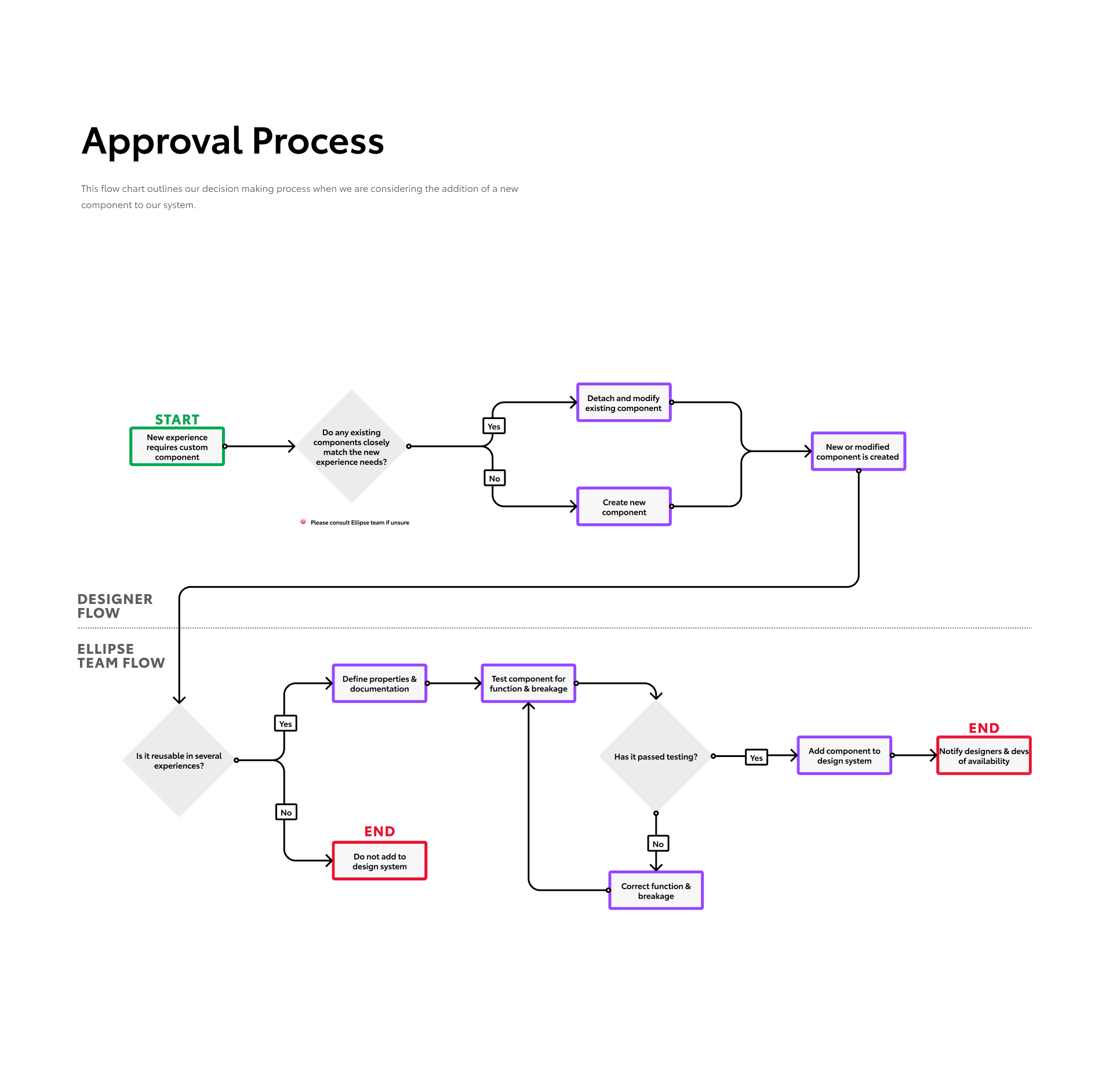
I reorganized the structure of the Ellipse design system and established a clear procedure for adopting new components,
IDEATION
Working Out the Kinks
By meeting with high-level stakeholders at Toyota and conducting thorough testing, our team was able to evaluate multiple design approaches. These discussions helped align the project with strategic goals, while testing provided valuable user insights. This process allowed us to assess various options critically and ultimately select the optimal design choice that best balanced business objectives with user experience.
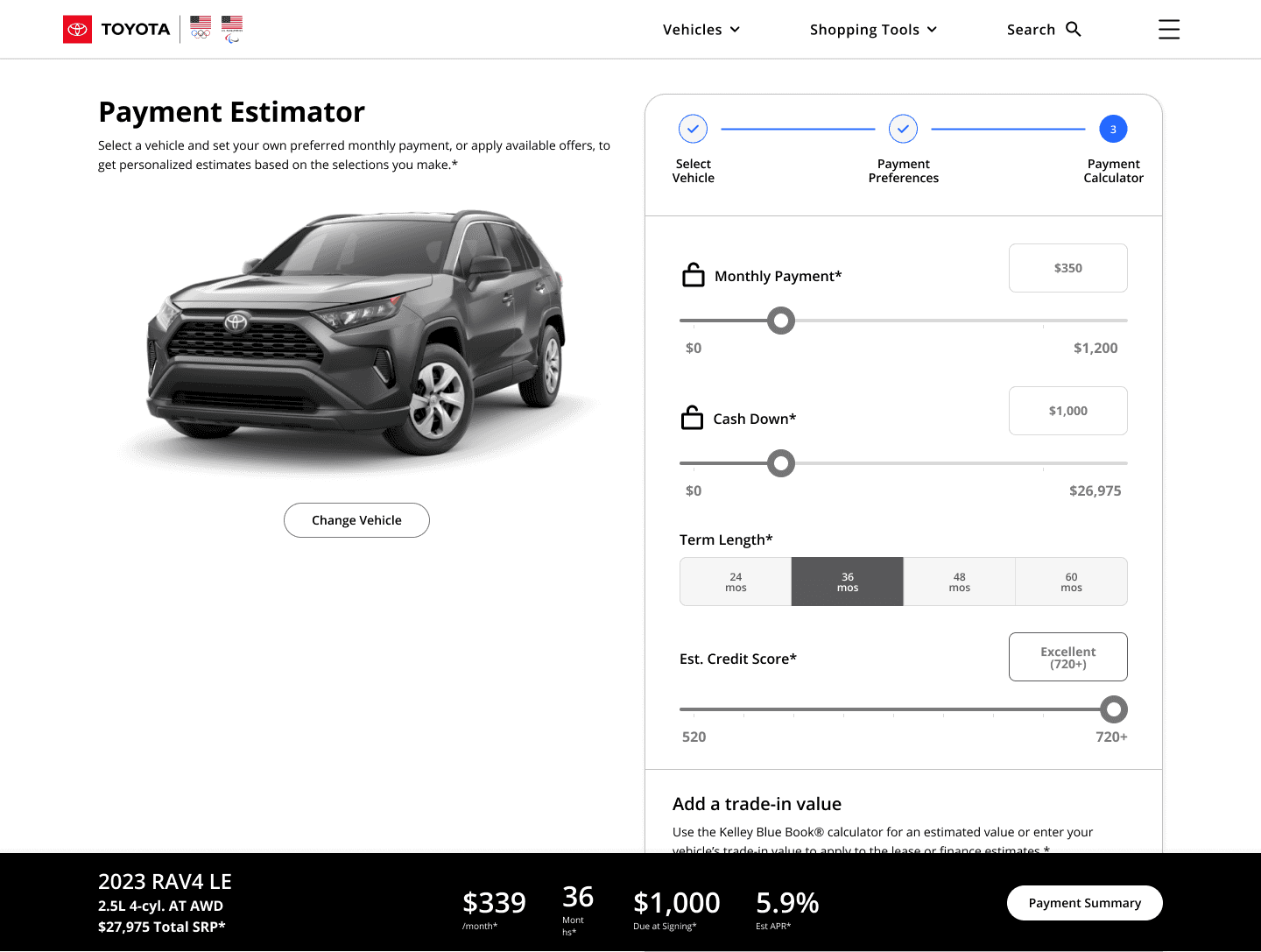
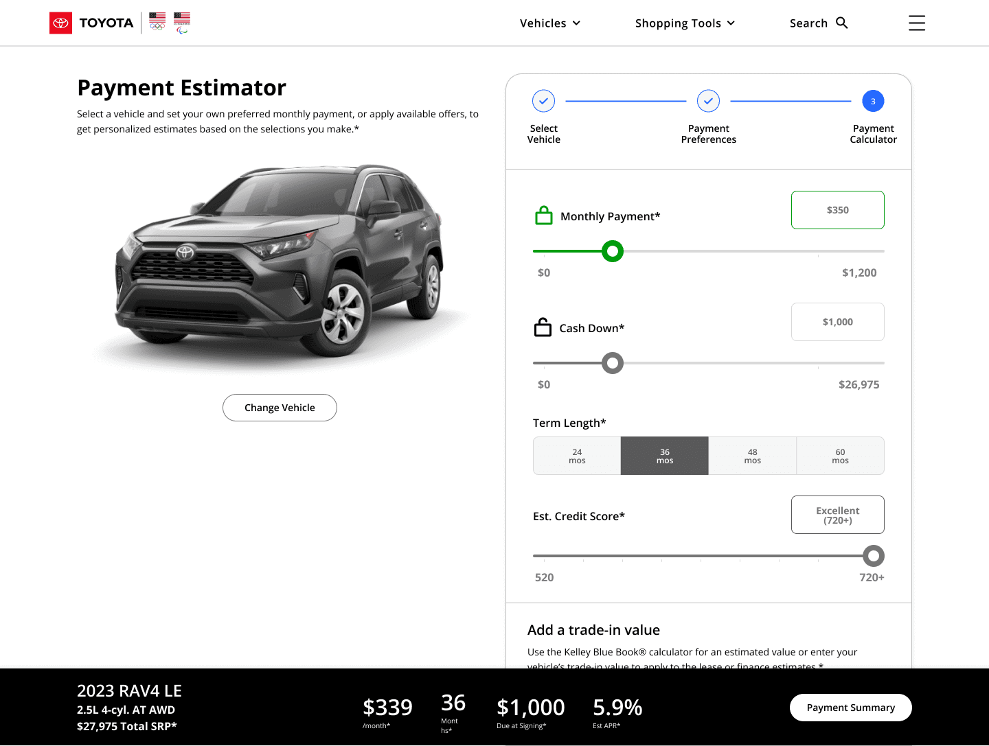
Locking Feature Removed
The input-locking feature was dropped due to backend limitations and poor testing results, as it couldn’t be supported and frustrated users.
Unlocked
Locked
DELIVERABLES
The Outcome
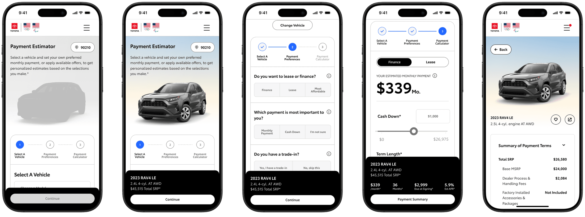
Our research insights, experience design, and iterative process led to a progressive disclosure approach that greatly improved the previous payment estimator. By revealing information gradually, the new design made the experience more intuitive and user-friendly, enhancing usability and aligning better with user needs. Figma files were delivered to development with 5 viewport sizes and highly specific annotations.
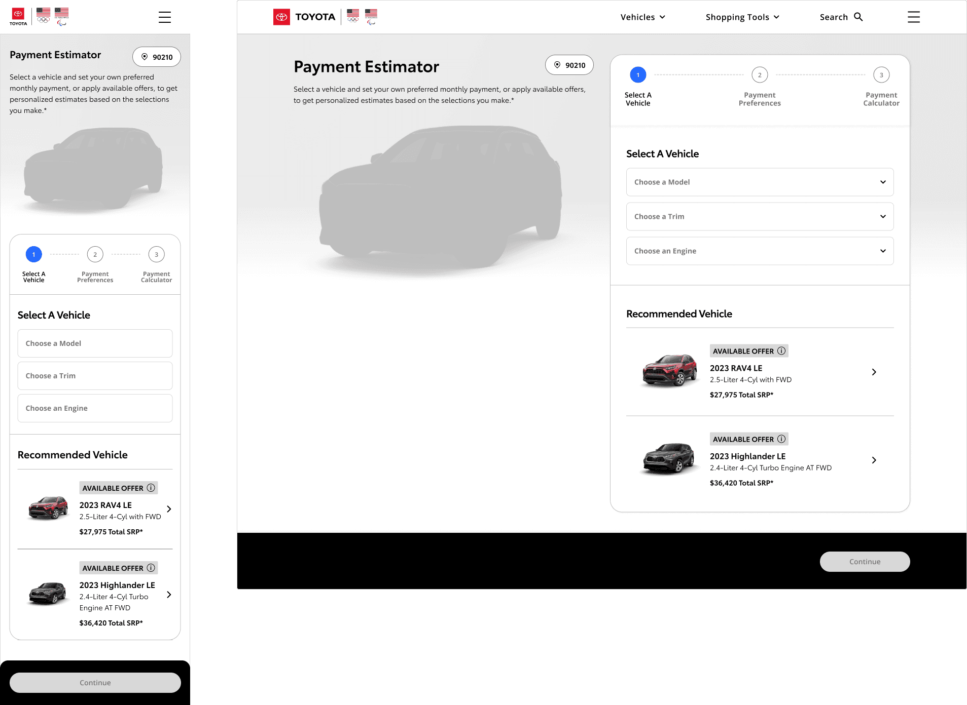
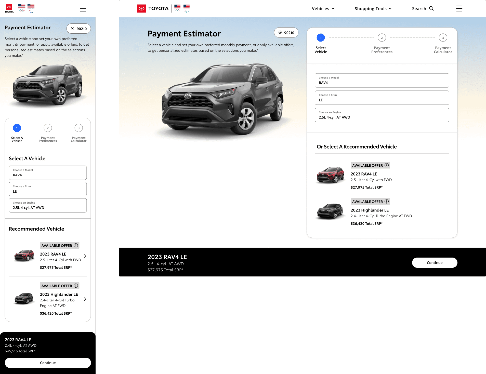
Vehicle Selection
The first step of the tool requires users to select the model, trim, and engine of the vehicle they are interested in. At this stage, they can also view and select any available offers to further customize their experience and pricing options. This initial selection sets the foundation for the rest of the estimator process.
Null - This is the state the user sees upon page load.
Filled - After the user selects their vehicle, its image will load alongside a complementary gradient, and the vehicle's information will populate within the price bar.
Payment Preferences
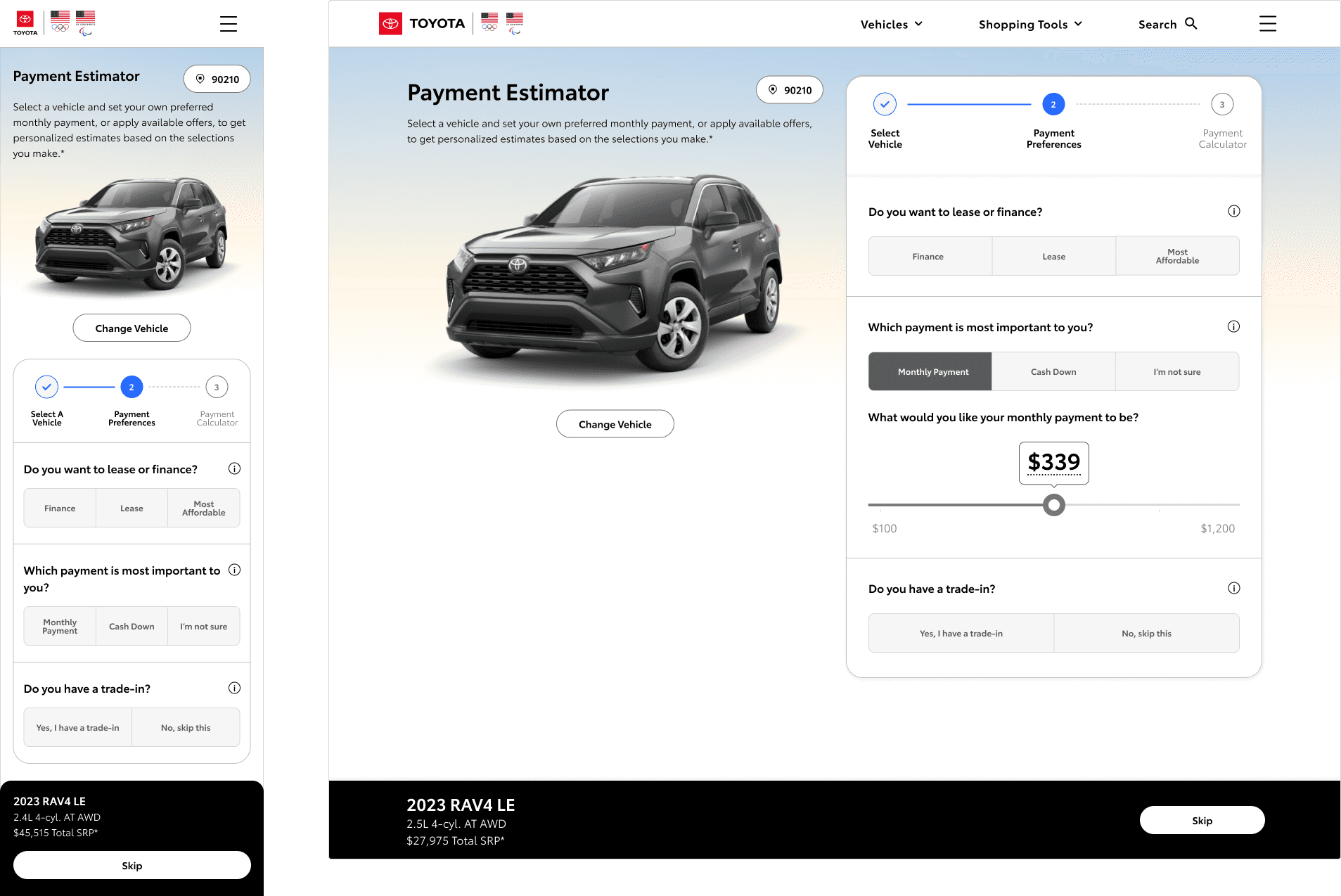
In the second step, users are prompted to choose the payment aspect most important to them, with a simple slider provided to adjust this preference in the next step. They can also select between lease or finance options and either enter or look up a trade-in value for their current vehicle.
The desktop viewport demonstrates the slider function after the user has selected their most important payment type.
KBB Trade-In Modal
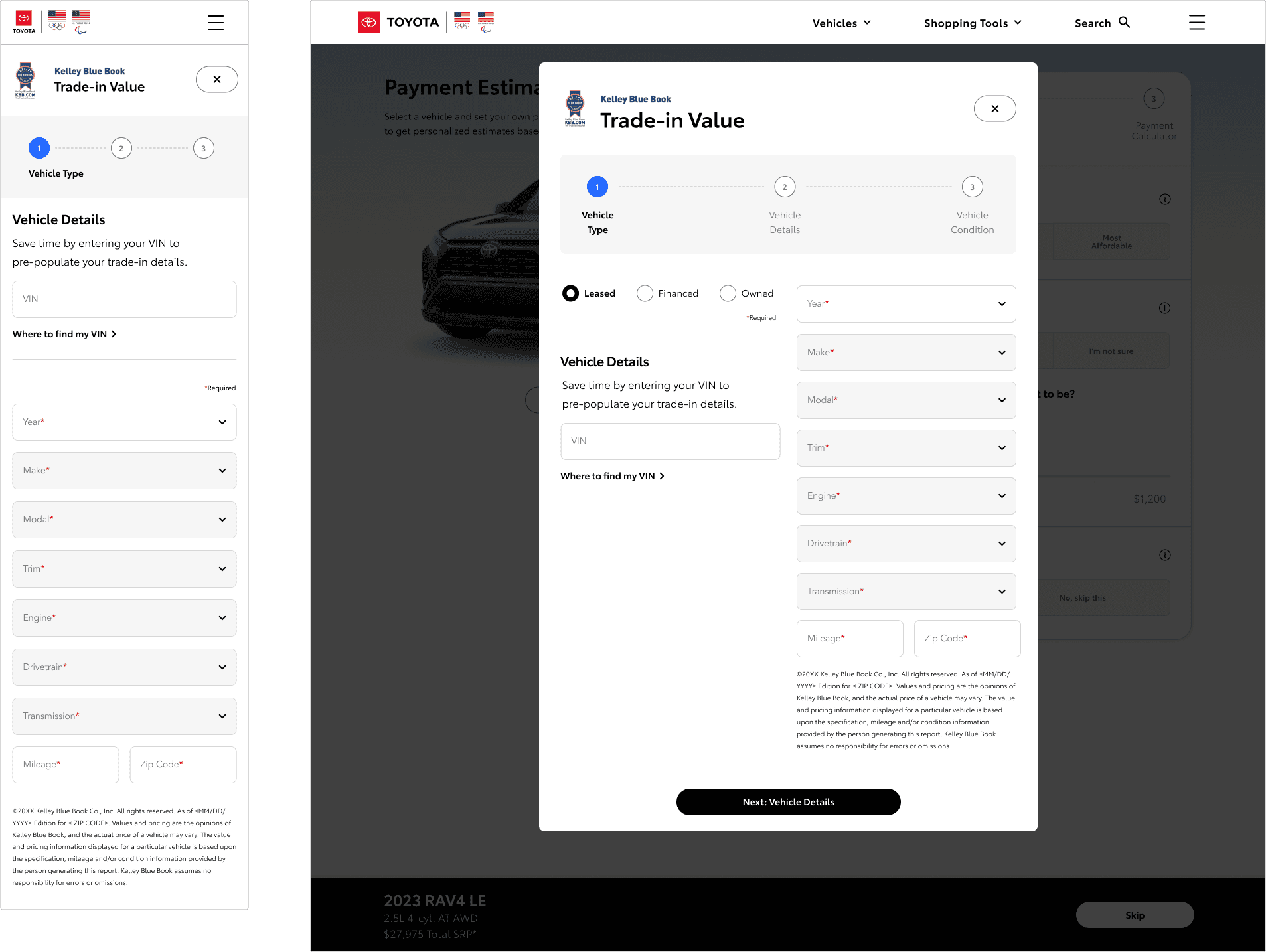
The KBB lookup tool was integrated with a multi-stage modal, allowing users to input their vehicle's details and condition to accurately assess its value. This value was then automatically populated into the estimator tool for a seamless experience.
Payment Calculator
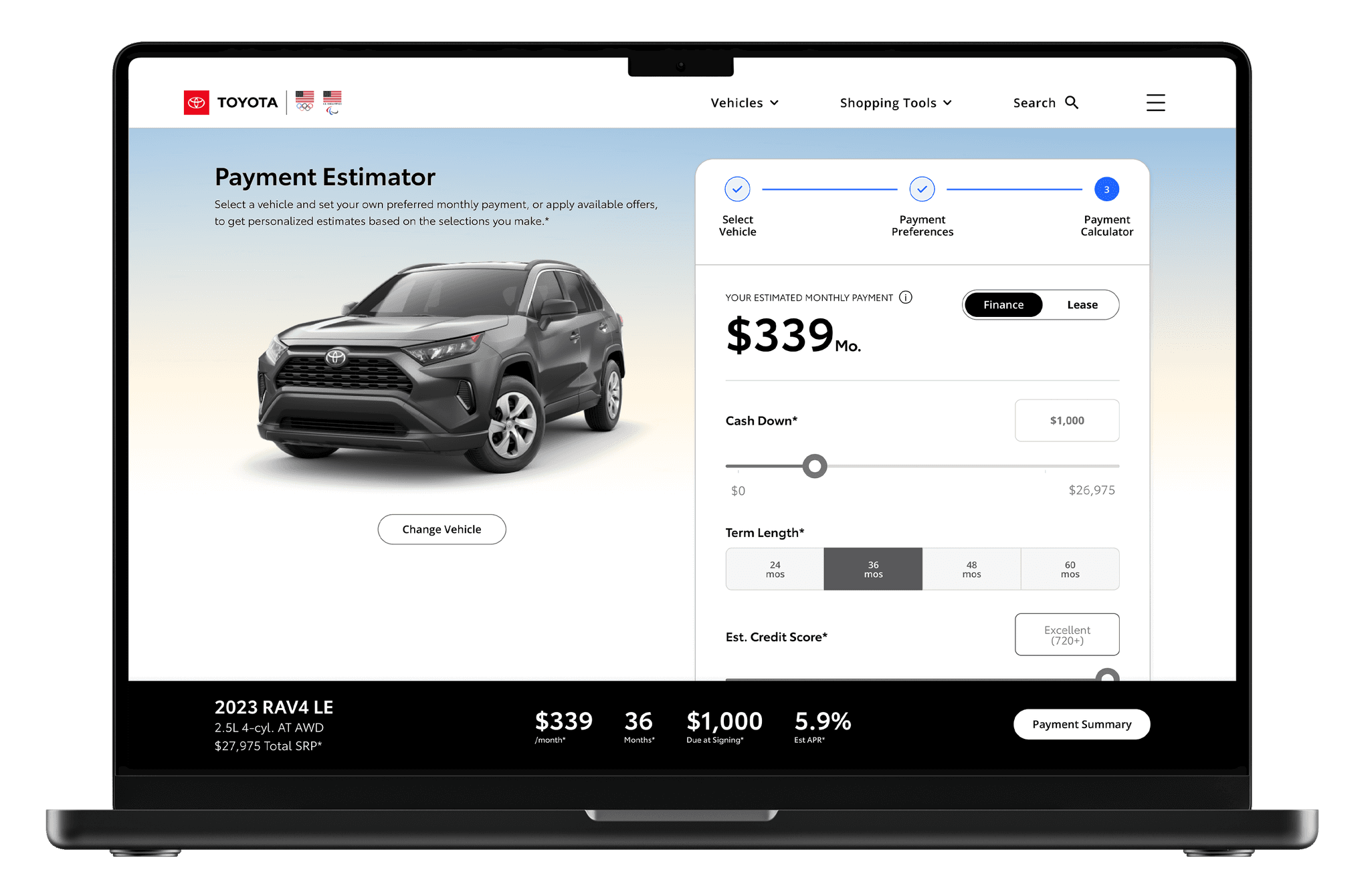
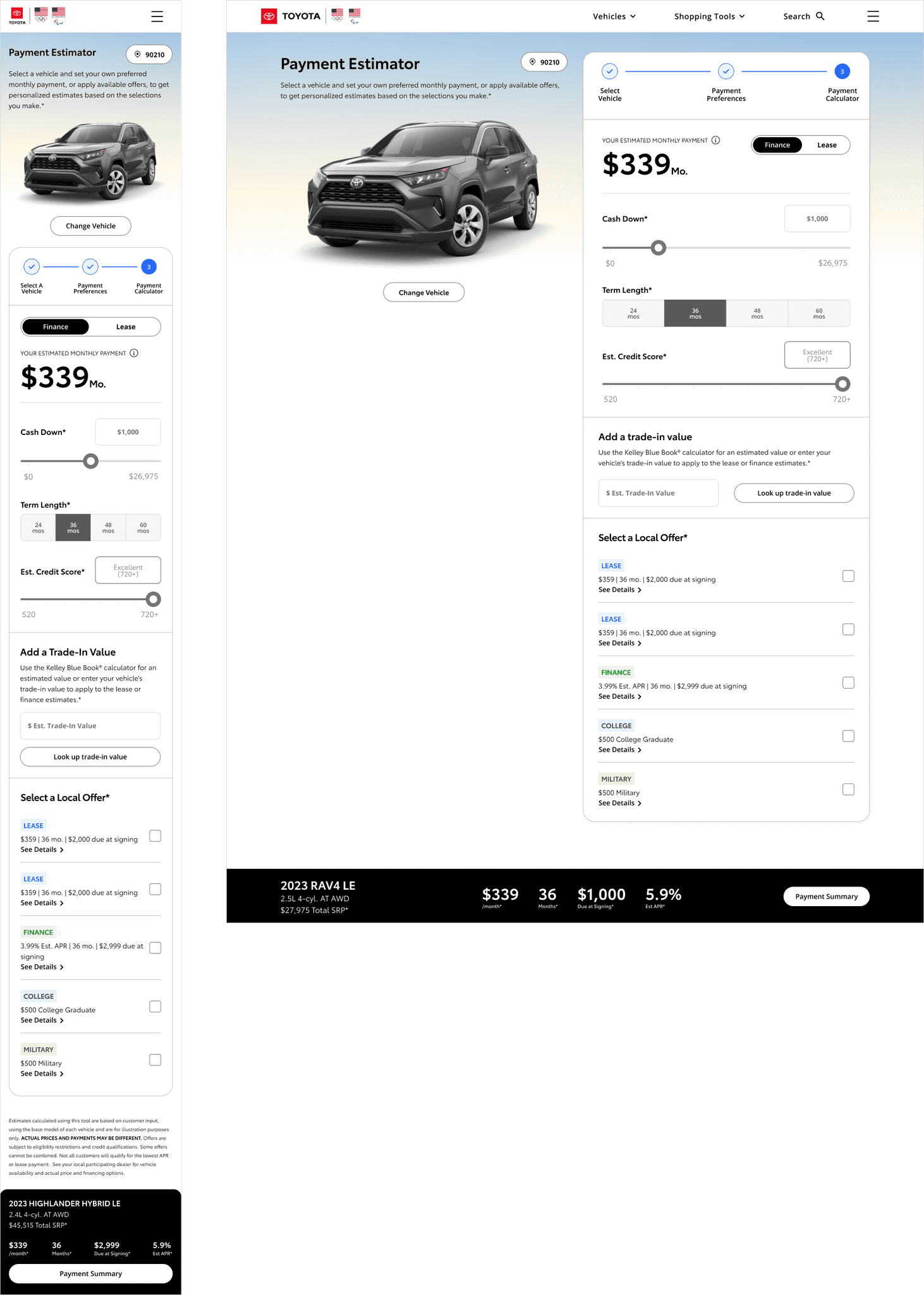
In the third step, users clearly see their selected payment type with dynamic sliders that allow them to adjust payments in real time. They can also review and apply current offers on the vehicle and, if not done earlier, enter trade-in details to further personalize their payment estimate.
Summary Page
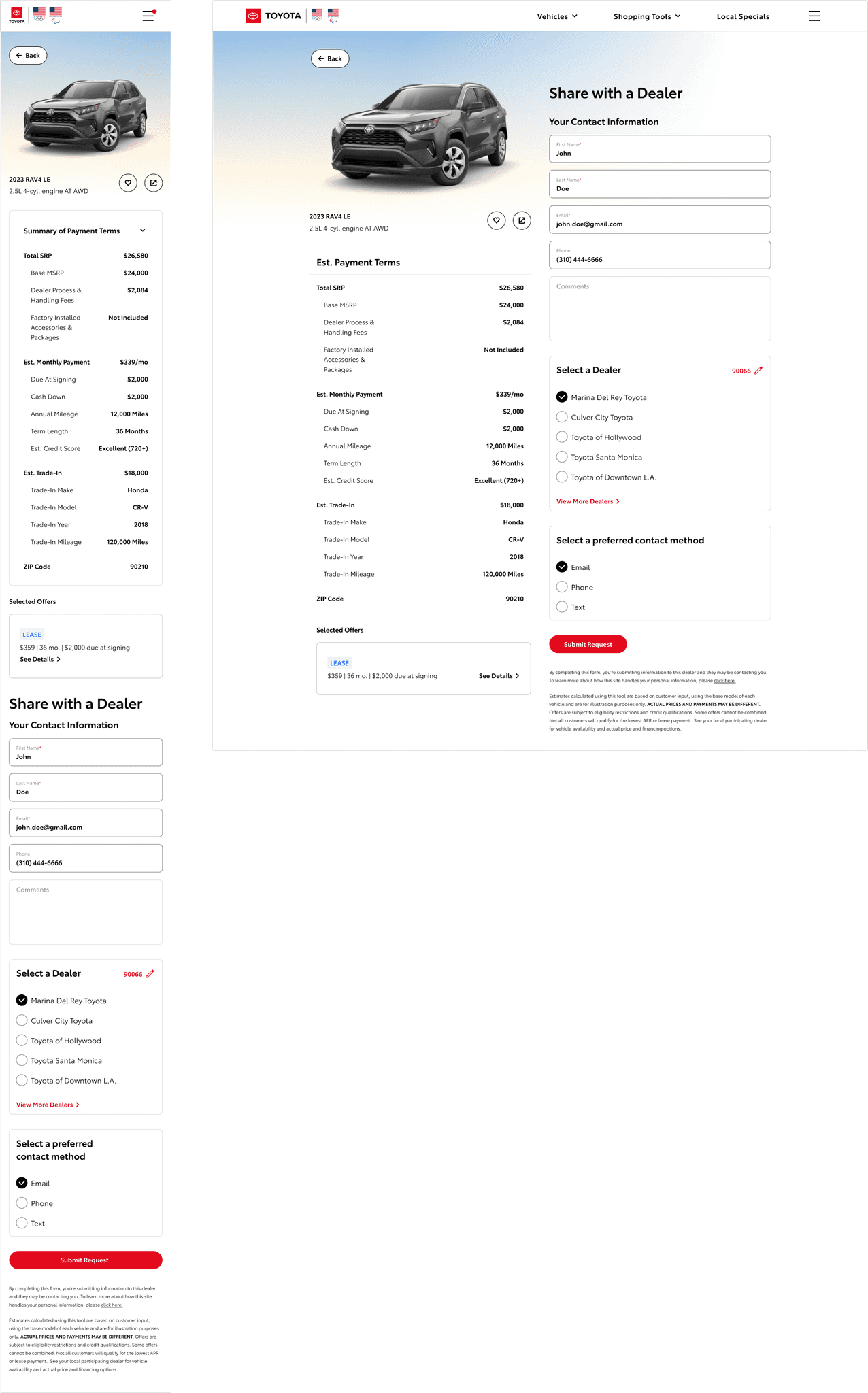
Once the user selects two or more permits, they can compare them side by side. A sticky footer was implemented to keep CTAs visible, along with accordions and both horizontal and vertical scrolling to ensure the comparison details are easily accessible.
TOYOTA RETROSPECTIVE
Looking back, the project successfully combined user research, design iteration, and technical integration to enhance the user experience. From building user flows to incorporating the KBB trade-in modal and dynamic payment adjustments, each step was refined through testing and feedback. The result was a streamlined tool that improved engagement, met business goals, and provided a more intuitive experience for users.
