UX, TESTING & VISUAL DESIGN
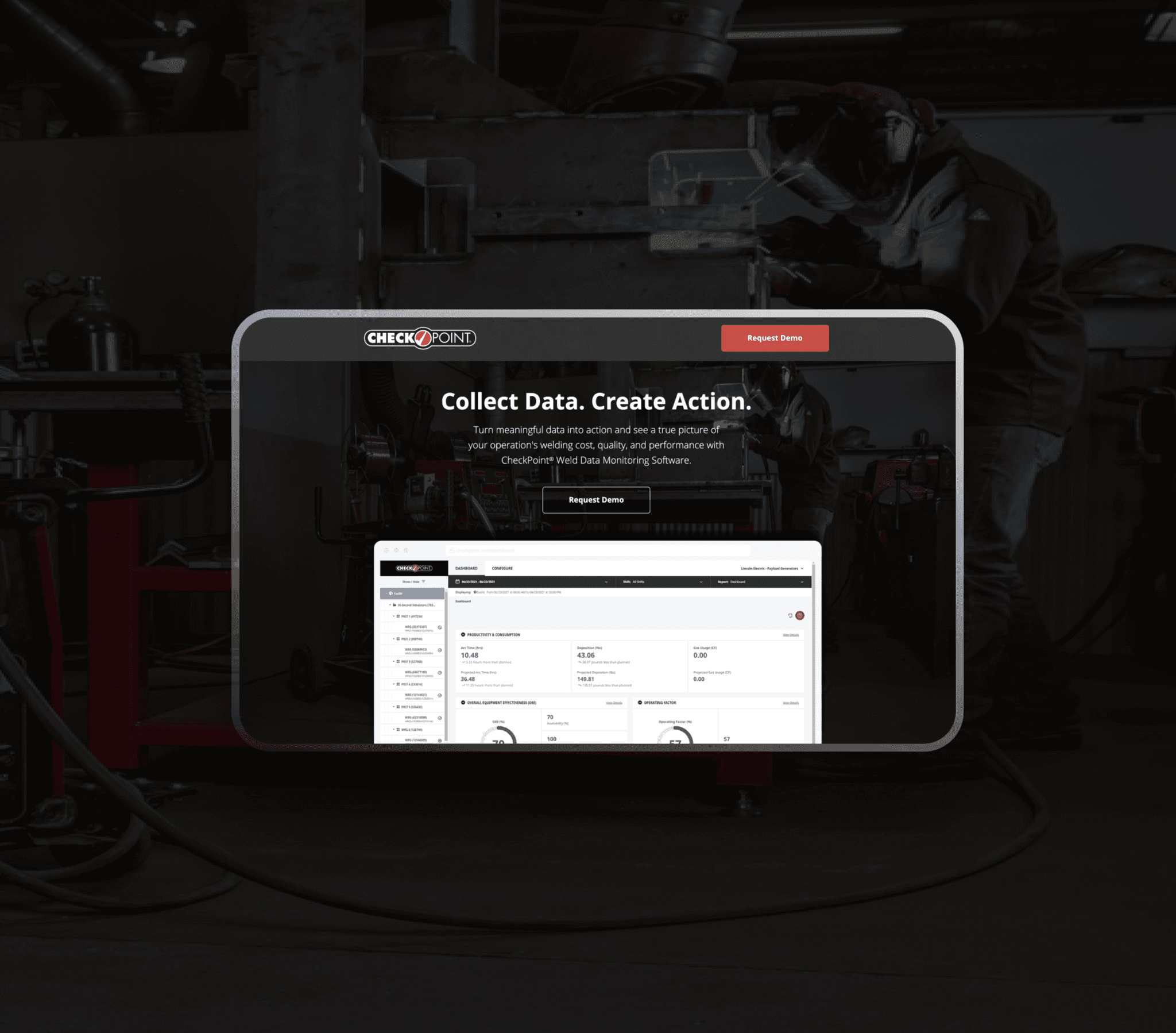
A landing page for Lincoln Electric’s Checkpoint monitoring software, highlighting its key features
Agency
In House
Role
Timeframe
2 Months
Team
Marketing Specialist
Problem
Lincoln Electric needed a landing page to promote its weld monitoring software, Checkpoint, in order to generate sales leads and enable follow-up opportunities. The challenge was to create an effective page using a user-centered approach to maximize impact while minimizing resource expenditure.
Solution
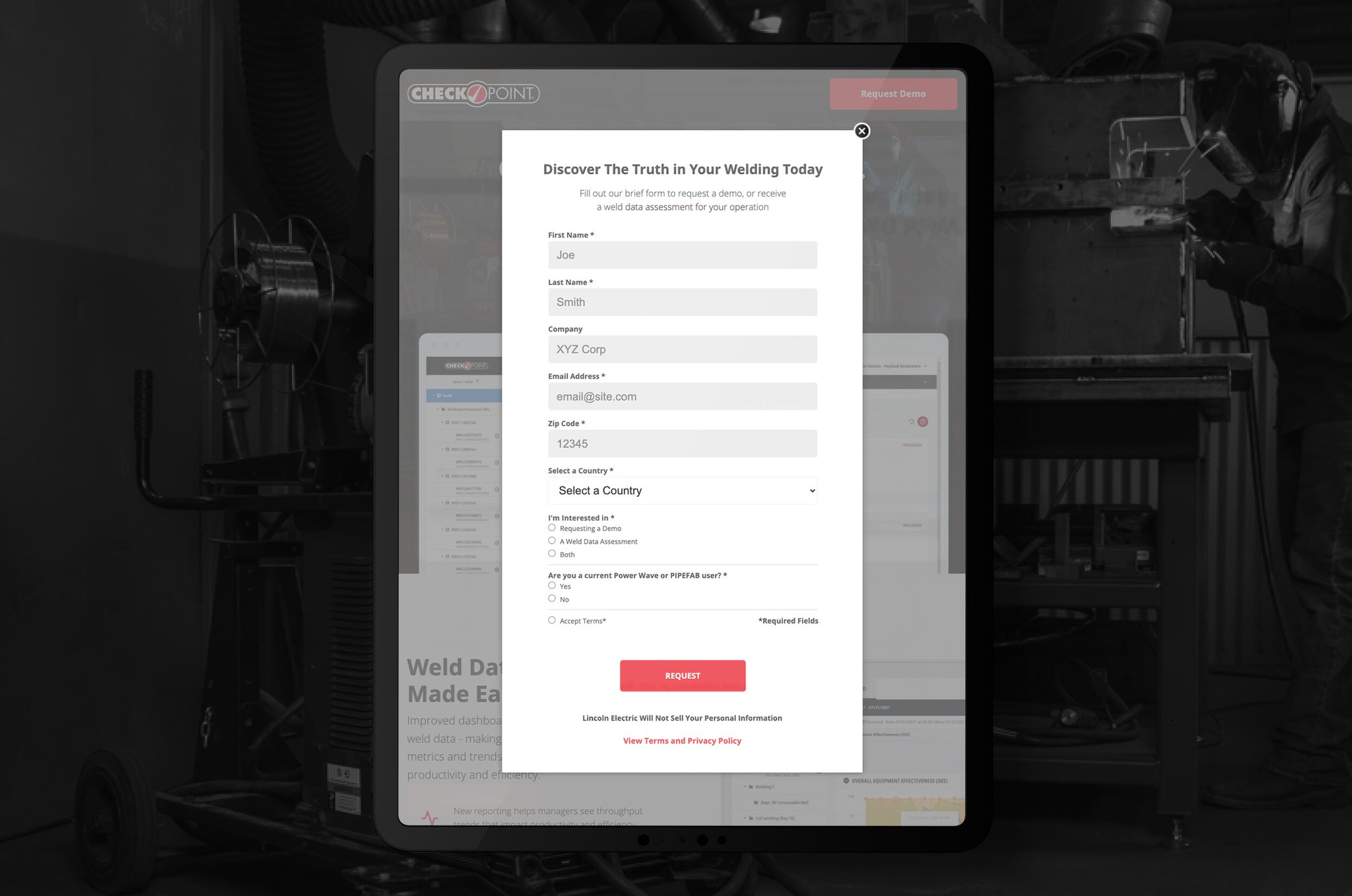
The solution involved designing a streamlined landing page focused on driving lead generation and enabling follow-up opportunities for Lincoln Electric's Checkpoint software. The page was optimized for both efficiency and effectiveness, ensuring it met business goals while providing a seamless user experience.
RESEARCH
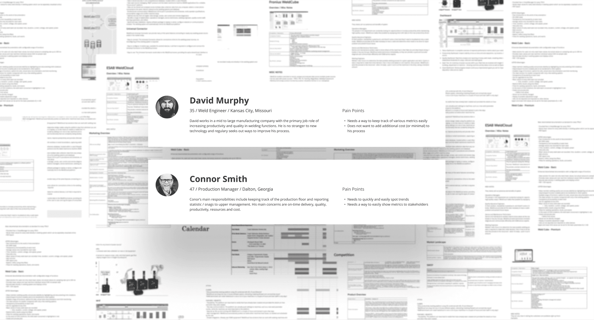
I began the process by leveraging personas provided by our research partners, which gave valuable insights into the target audience's needs and behaviors. To further inform the design, I conducted competitive and analogous research to understand how similar products approached user engagement and functionality. This combination of persona-driven insights and market analysis laid a solid foundation for creating a user-centered and effective design strategy.
Key Insights
Users needed to quickly understand the service's value and that it complemented their existing tools. This shaped the design to deliver clear, concise messaging upfront, ensuring the value proposition was immediately evident. We also learned what content our users care most about and built out the page to reflect that.
SKETCHING & WIREFRAMING
The marketer and I worked together to create an information architecture outline for the landing page, organizing key content and messaging. Using this framework, I then started sketching the layout to ensure the design highlighted the most important information in a clear and user-friendly way.
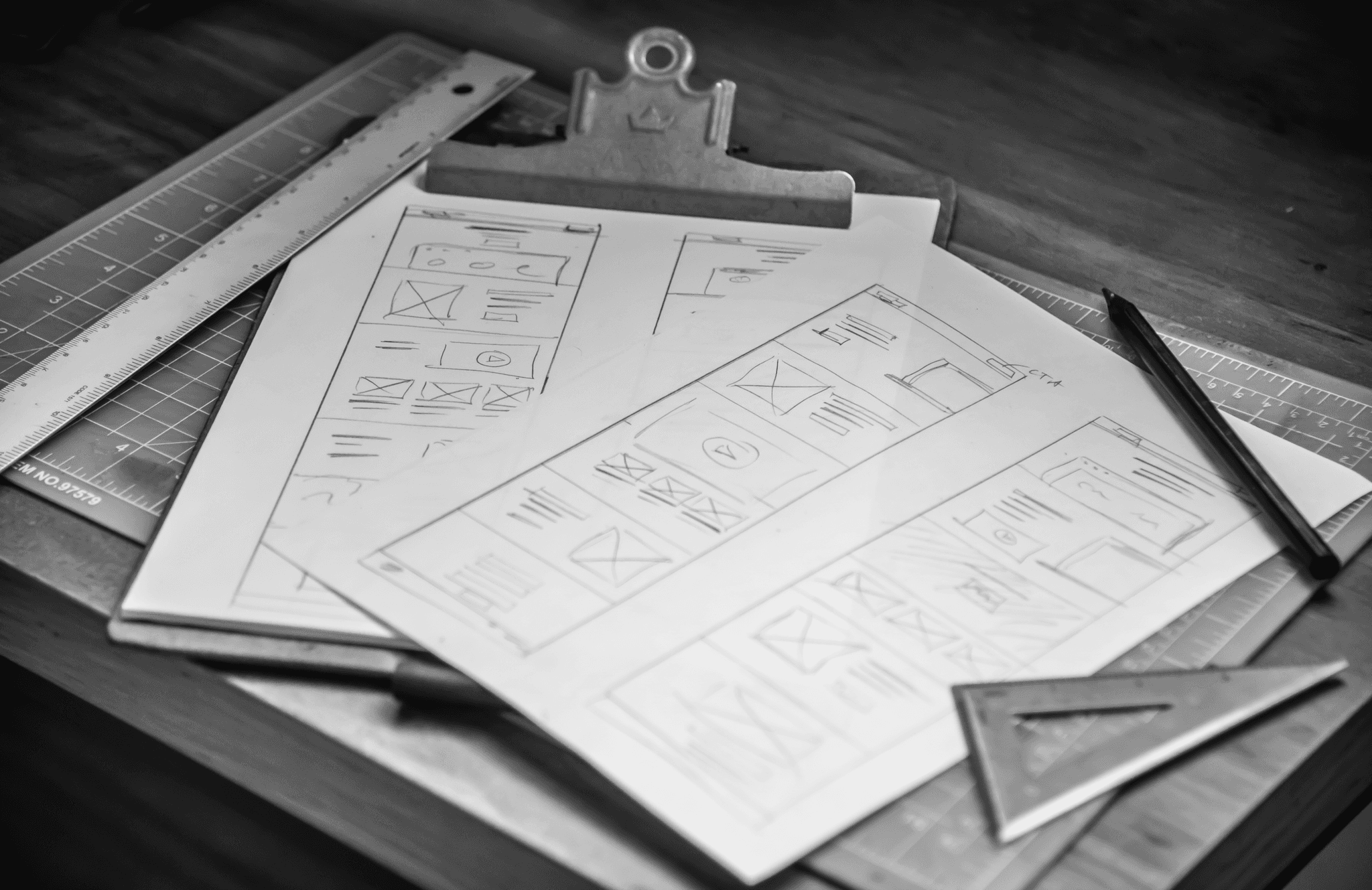
Sketching
In the sketching process, I quickly explored layouts to align with the information architecture, focusing on highlighting key content and refining the structure before moving to digital design.
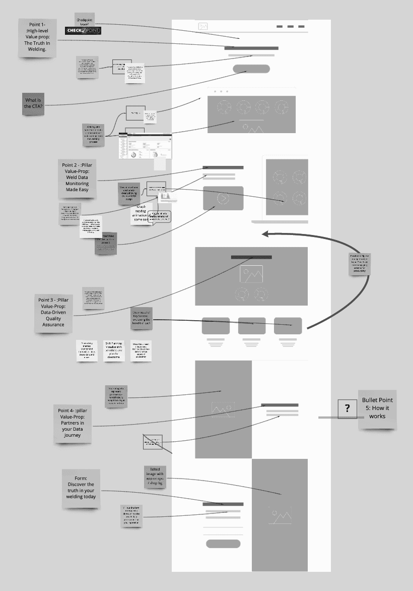
Wireframing
After sketching, I moved the designs into digital low-fidelity wireframes to refine the layout and structure further. This step focused on usability and ensured that key content was positioned effectively. The wireframes provided a clear representation of the page’s flow, allowing for adjustments before advancing to high-fidelity designs.
DESIGN
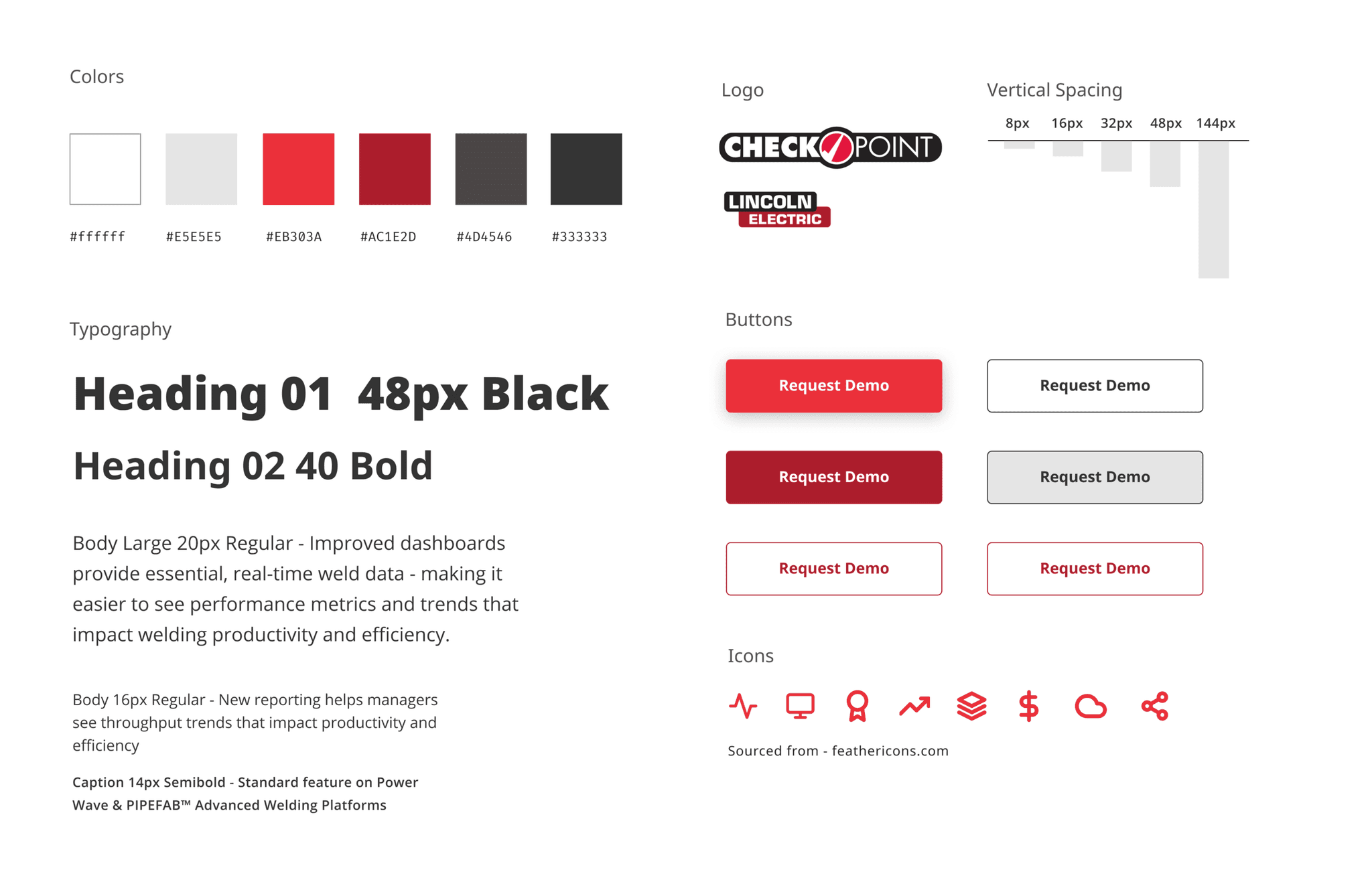
Lincoln Electric's loose typographic system served as the base for the Checkpoint landing page, but I refined it by creating a more consistent type scale and using a grid to maintain vertical rhythm across screen sizes. For colors, I stayed within brand guidelines but used a red from their machine nameplates for CTAs and icons, making them more eye-catching while keeping the design on-brand.
USER TESTING
Assessing Usability
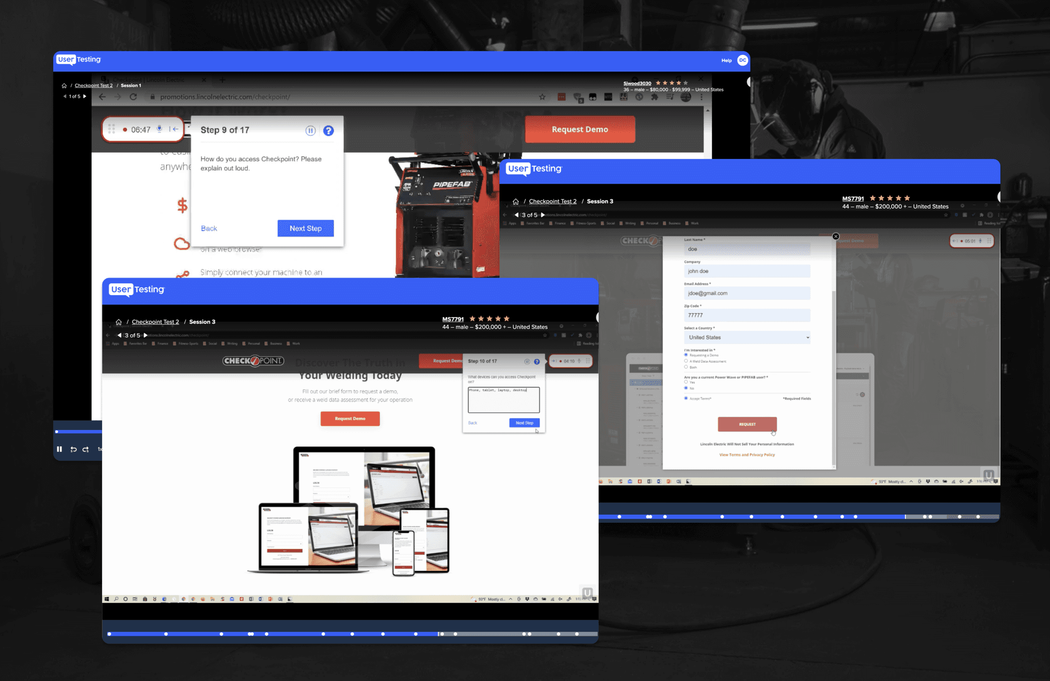
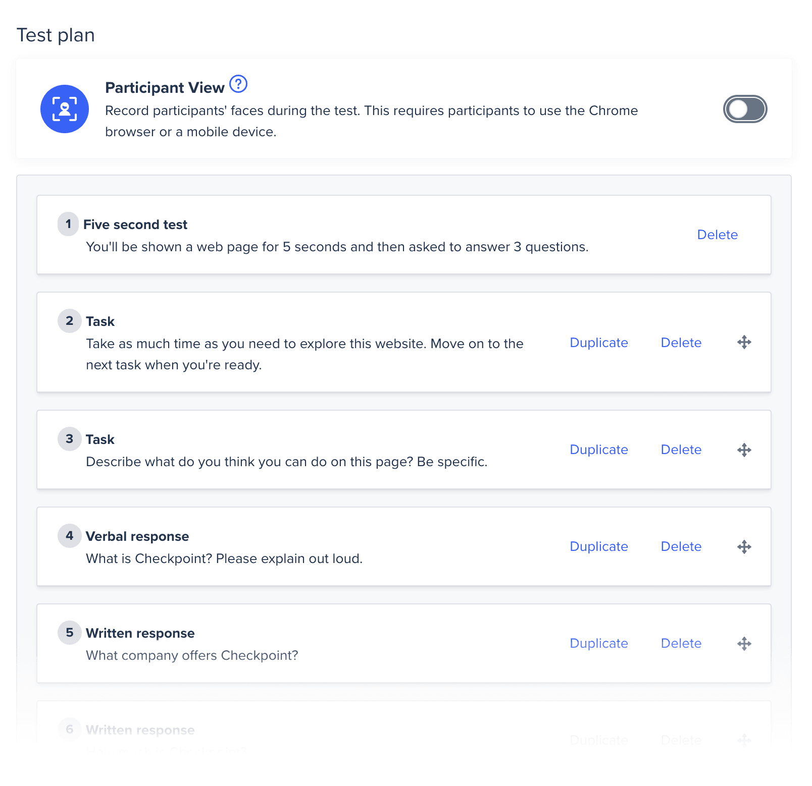
Before the site launch, I conducted a remote usability test with five participants using UserTesting.com. I selected the target demographic and prepared tasks and questions focused on evaluating the site's usability and messaging comprehension.
Remote User Testing
I conducted remote user testing with five participants performing 17 tasks on UserTesting.com to assess usability and messaging. I also included general questions to settle debates on other pages, such as users' understanding of scrolling and whether they noticed information past the "fold," providing valuable insights for improvements.
Testing Insights
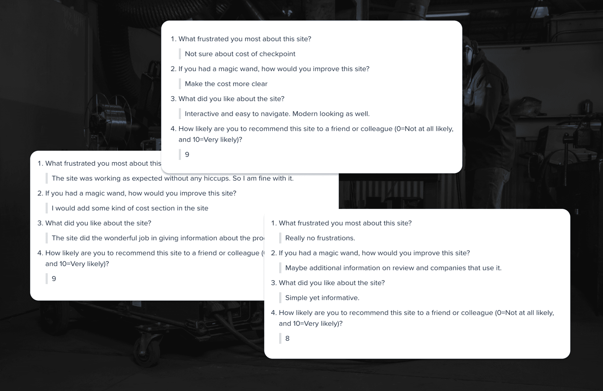
In a 5-second test, all users quickly grasped the purpose of the landing page, confirming the design’s effectiveness. However, 4 out of 5 users didn’t realize that Checkpoint was a free service, revealing a gap in the messaging. While the page communicated its key message well, it needed adjustments to clarify that Checkpoint was a no-cost offering.
User 1
"I would add some kind of cost section on the site."
User 2
“I would like to see the cost somewhere on the page and have the video be a more prominent feature.”
User 3
"Could not find the cost . Would be nice if that was there."
User 4
"Make the cost more clear."
DELIVERABLES
The Outcome
The design outcome successfully balanced aesthetics and functionality, resulting in a visually appealing and user-friendly page. Key content was clearly communicated, and usability testing ensured that users could quickly understand the service and its value. The final design met business goals while offering an engaging experience for users, with ongoing improvements enhancing its effectiveness over time.
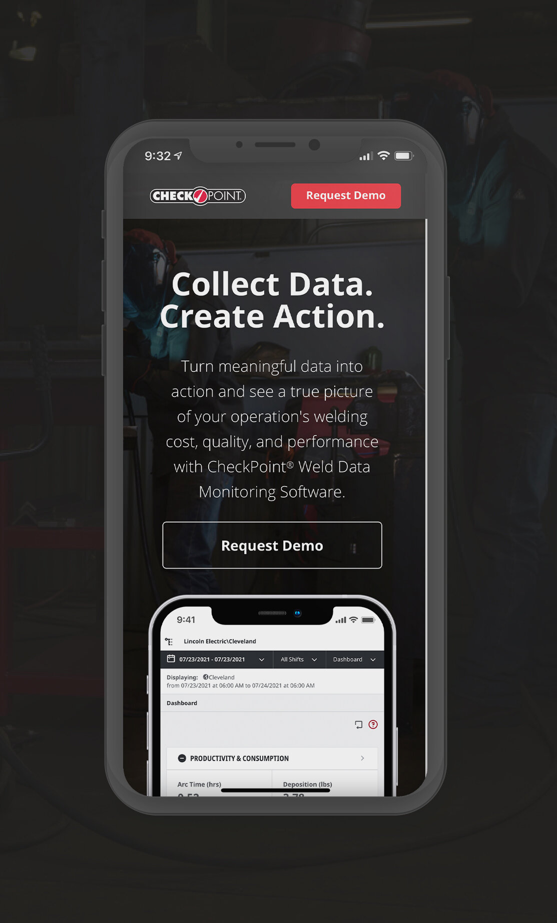
Responsiveness & Animation
The fully responsive page design featured subtle animations to enhance engagement, creating a dynamic and user-friendly experience across all devices.
A/B Testing
After launch, A/B testing was conducted on video size, cost information, and CTA placement, based on stakeholder input and usability testing. While the video adjustment saw a small conversion increase, clarifying cost information boosted conversions by 21%. The page continues to be optimized as the campaign progresses.
LINCOLN ELECTRIC RETROSPECTIVE
Since Lincoln Electric had not previously used a user-centered design approach, some stakeholders were initially hesitant to trust the qualitative data, especially when it contradicted assumptions based on quantitative data. However, after the campaign launched and didn't immediately meet its goals, they became open to testing. This testing resulted in significant improvements, which ultimately built their trust in the user-centered design process.
