RESEARCH, UX & VISUAL DESIGN
A one-stop hub for Burton products, events, athletes, and essential snowboarding resources.
Role
Team
Development
Problem
Snowboarding enthusiasts currently lack a unified platform where they can easily access Burton Snowboards' products, events, athlete updates, resort details, and weather forecasts. This scattered information leads to a fragmented and frustrating user experience.
Solution
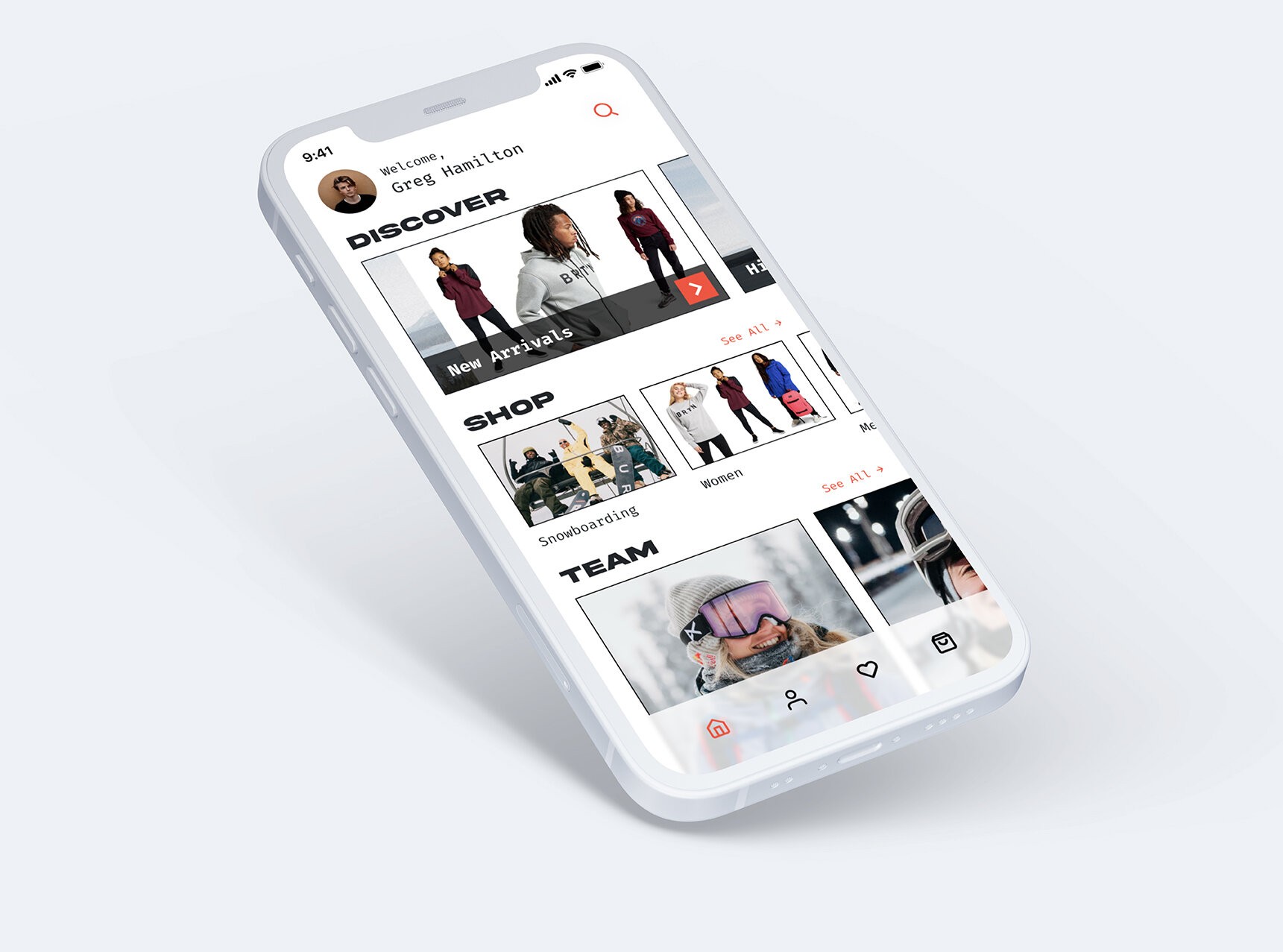
Develop a mobile app that consolidates all aspects of the Burton Snowboards experience into one platform, showcasing products, events, and athletes while offering essential resources like resort info, weather forecasts, and networking. This app will streamline access and enhance the connection between users and the Burton brand.
RESEARCH
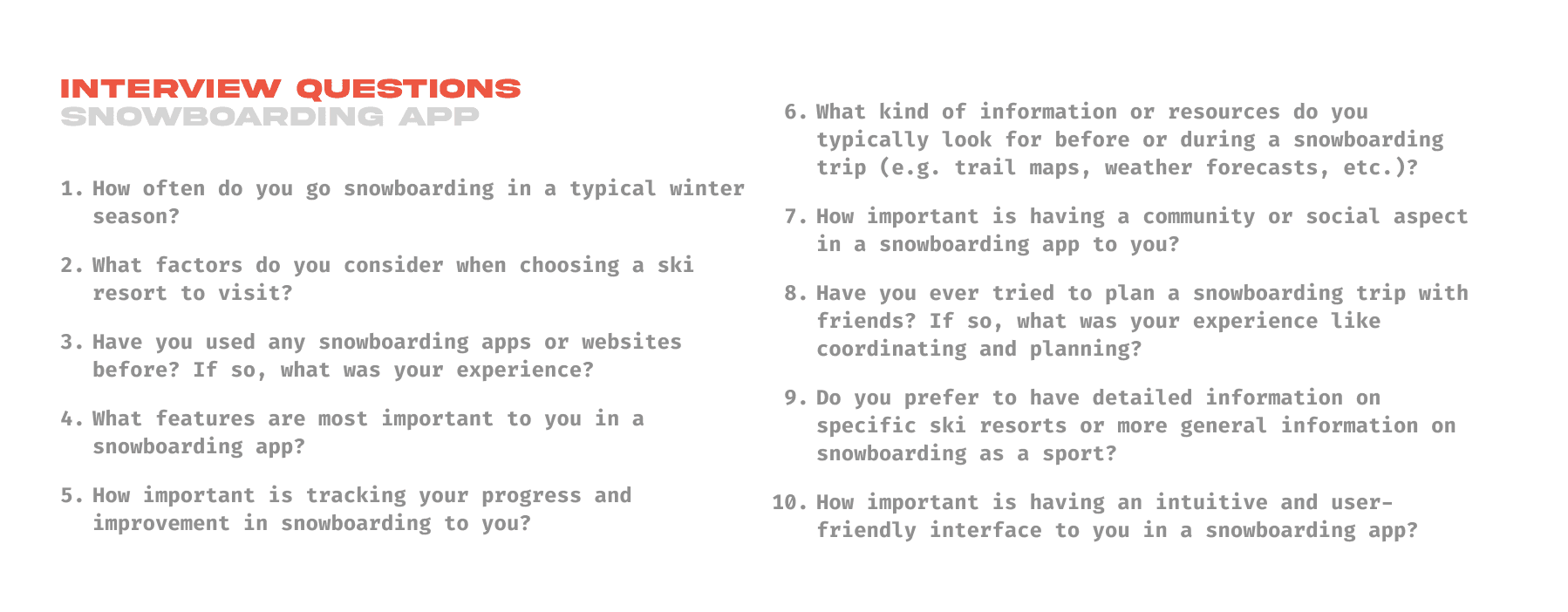
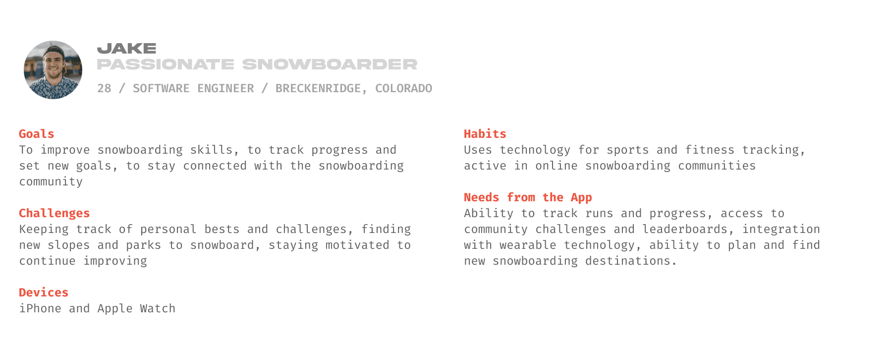
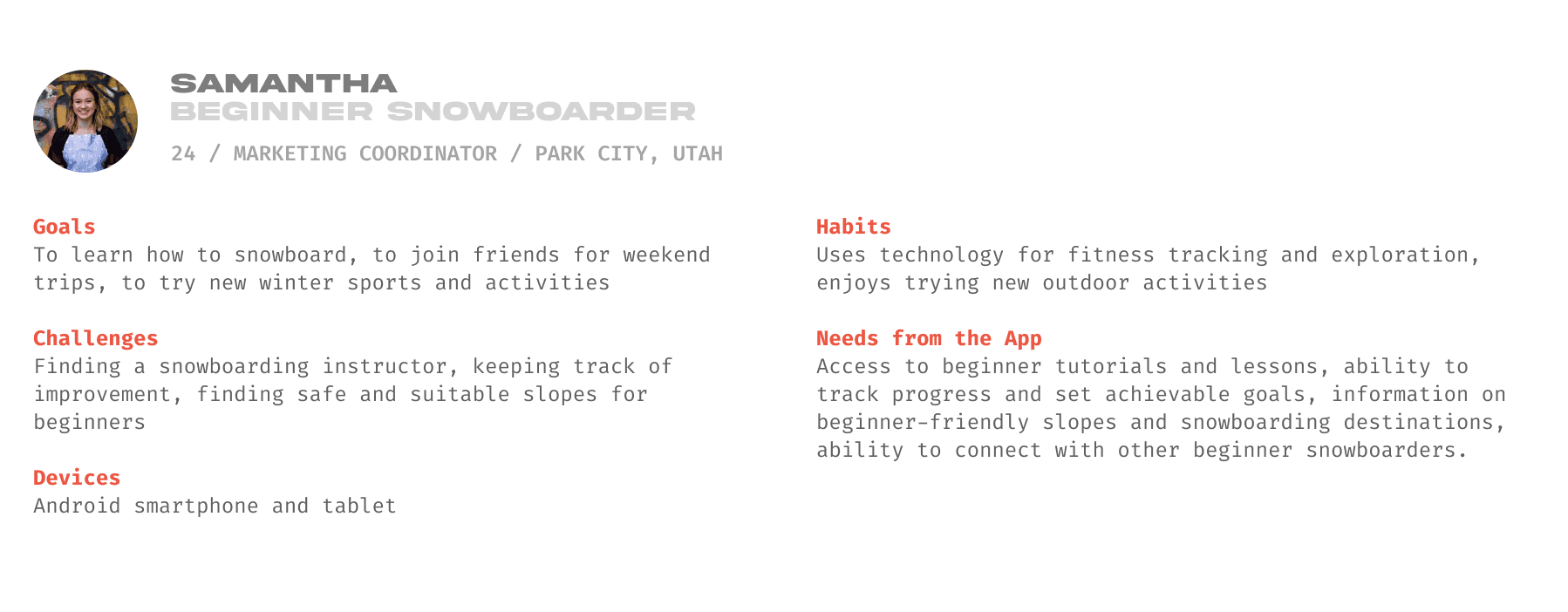
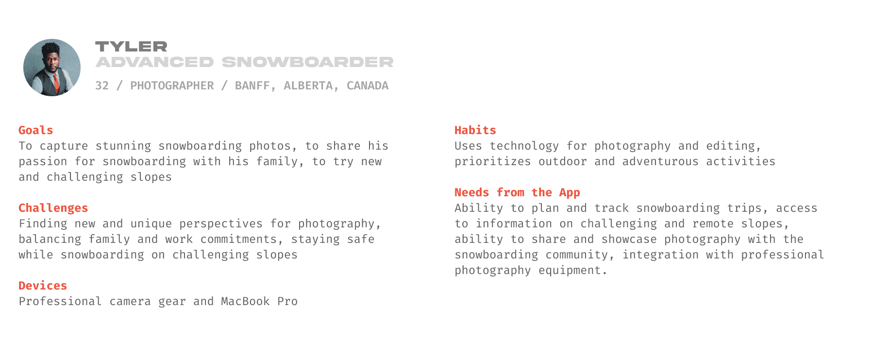
I conducted interviews with a diverse sample of snowboarders aged 21-35 to gather insights on their needs and behaviors. Analyzing the data revealed key recurring themes, which allowed me to create three distinct personas. These personas became essential references throughout the app development process, ensuring the design aligned with user expectations and experiences.
Main Insights
A key feature users consistently sought was the ability to connect socially within the app. Initially, they wanted to follow and stay updated on their favorite snowboarders, but the idea evolved into creating and sharing content with others in the snowboarding community. The goal became to foster connections, starting with riders posting content as part of the minimum viable product.
USER FLOW
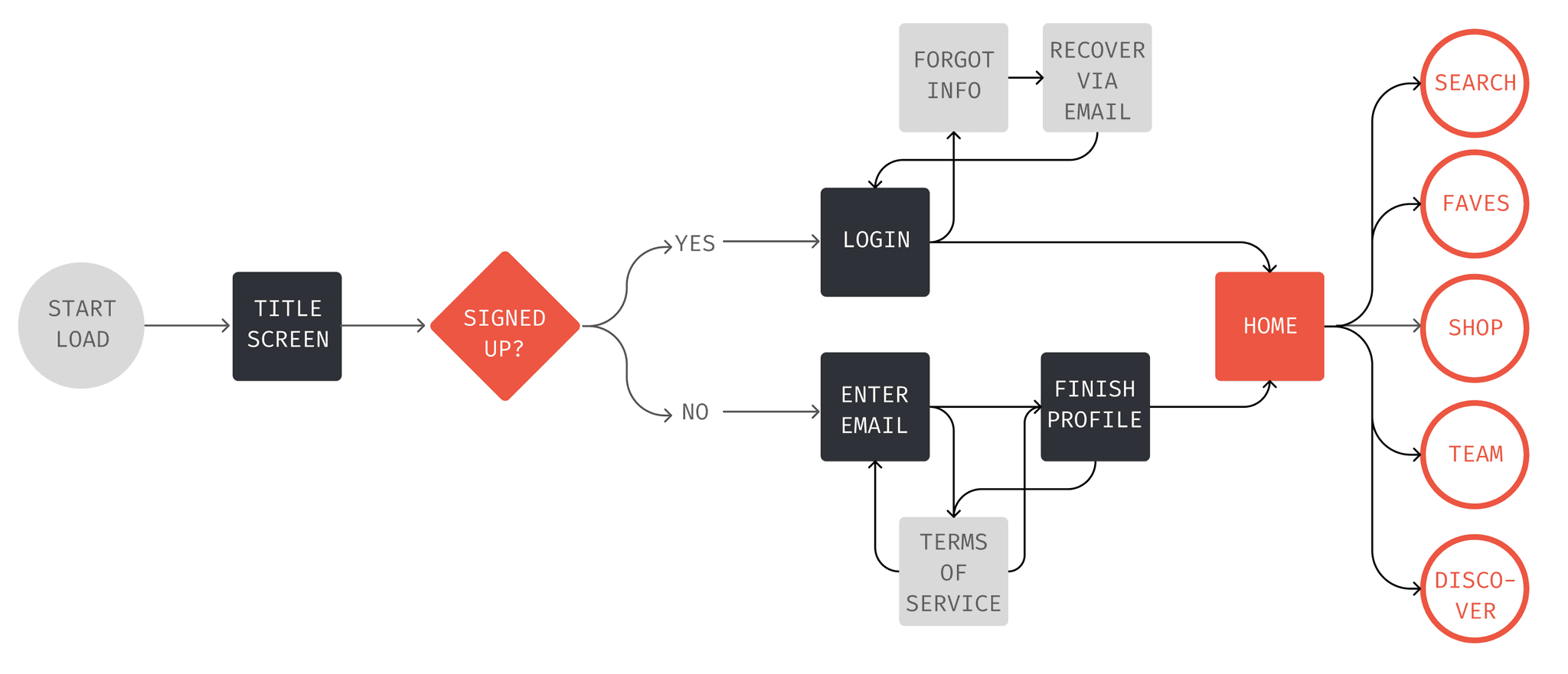
Based on the insights from the personas, I created a user flow that mapped out the ideal journey through the app. The flow considered each user's goals and needs, ensuring the design was easy to use and met their expectations. By focusing on key interactions, I made sure the app would provide a smooth and intuitive experience for all types of users.
A section of the overall user flow for the application
SKETCHING & WIREFRAMING
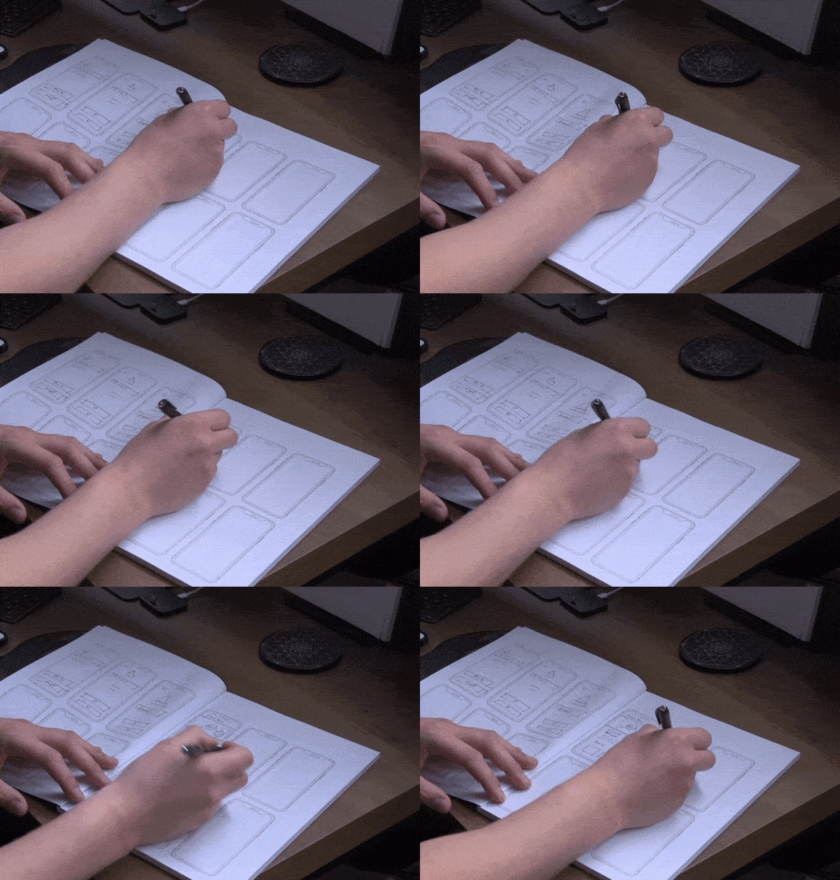
After developing the user flow, I began sketching and wireframing the new screens. Throughout the process, I used the established personas as a guiding principle, ensuring that my designs stayed focused on user needs and aligned with the project’s objectives. This approach helped keep the design user-centered and effective.
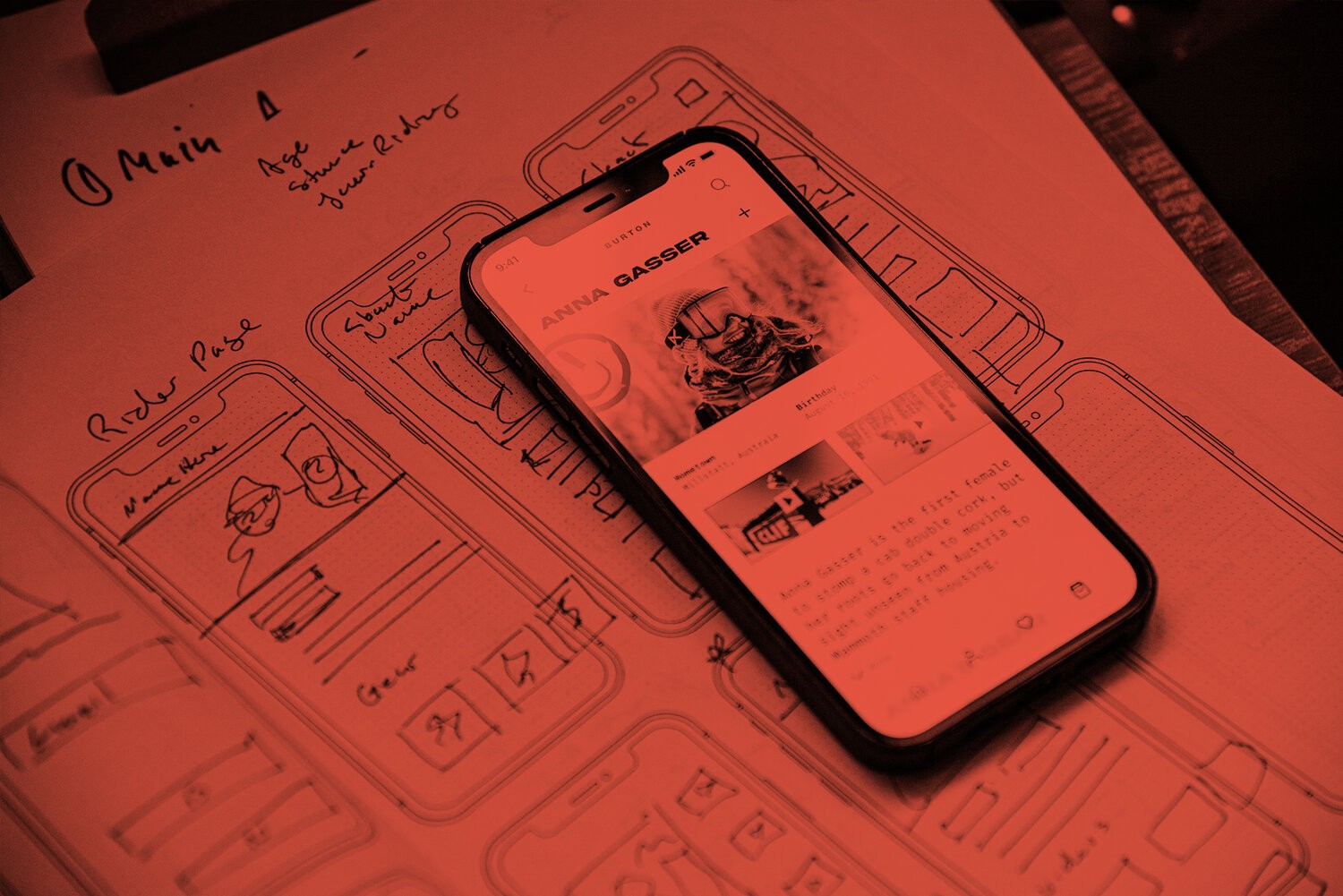
Sketching
While the user flow guided the layout, ensuring a logical and intuitive progression. sketches allowed me to quickly visualize the design, make early adjustments, and establish a strong foundation for wireframing and design.
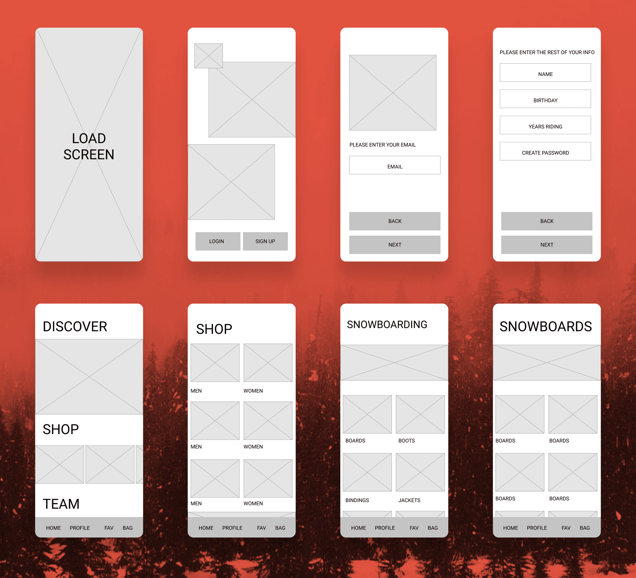
Wireframing
Using the sketches and user flow, I created low-fidelity wireframes in Figma to ensure the screen flow was logical and to resolve any issues with content order or grouping. This step helped refine the design before moving to higher-fidelity stages.
VISUAL DESIGN
Interface Design & Styles
The interface design drew heavily from Burton’s board graphics and overall visual style, aiming to infuse more personality than their website typically offers. I pushed for a more experimental and modern approach by incorporating several hand-drawn elements to contrast with the bold display typeface, complemented by a monospaced font. This balance added a unique and dynamic character.
Using Hand Drawn Elements
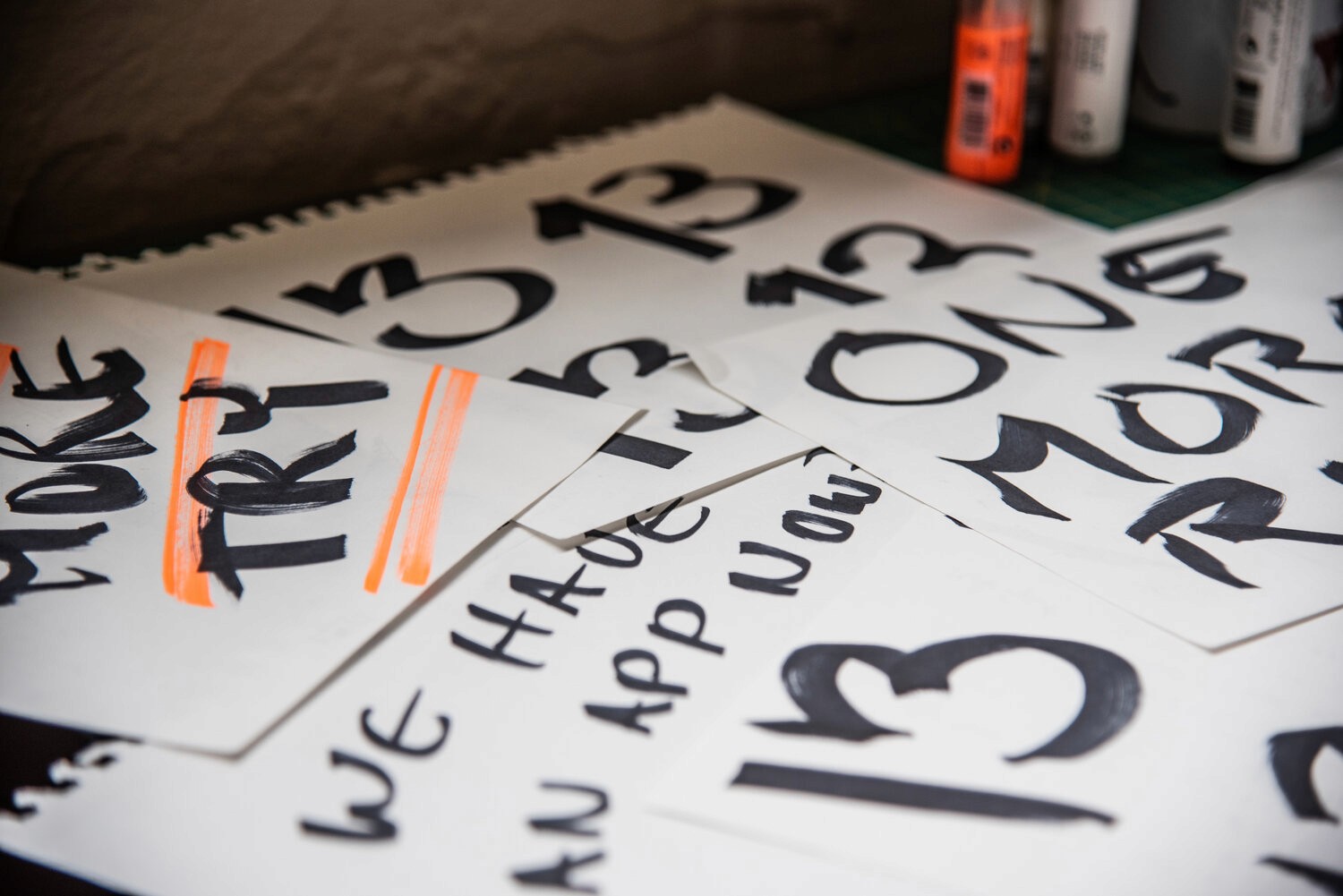
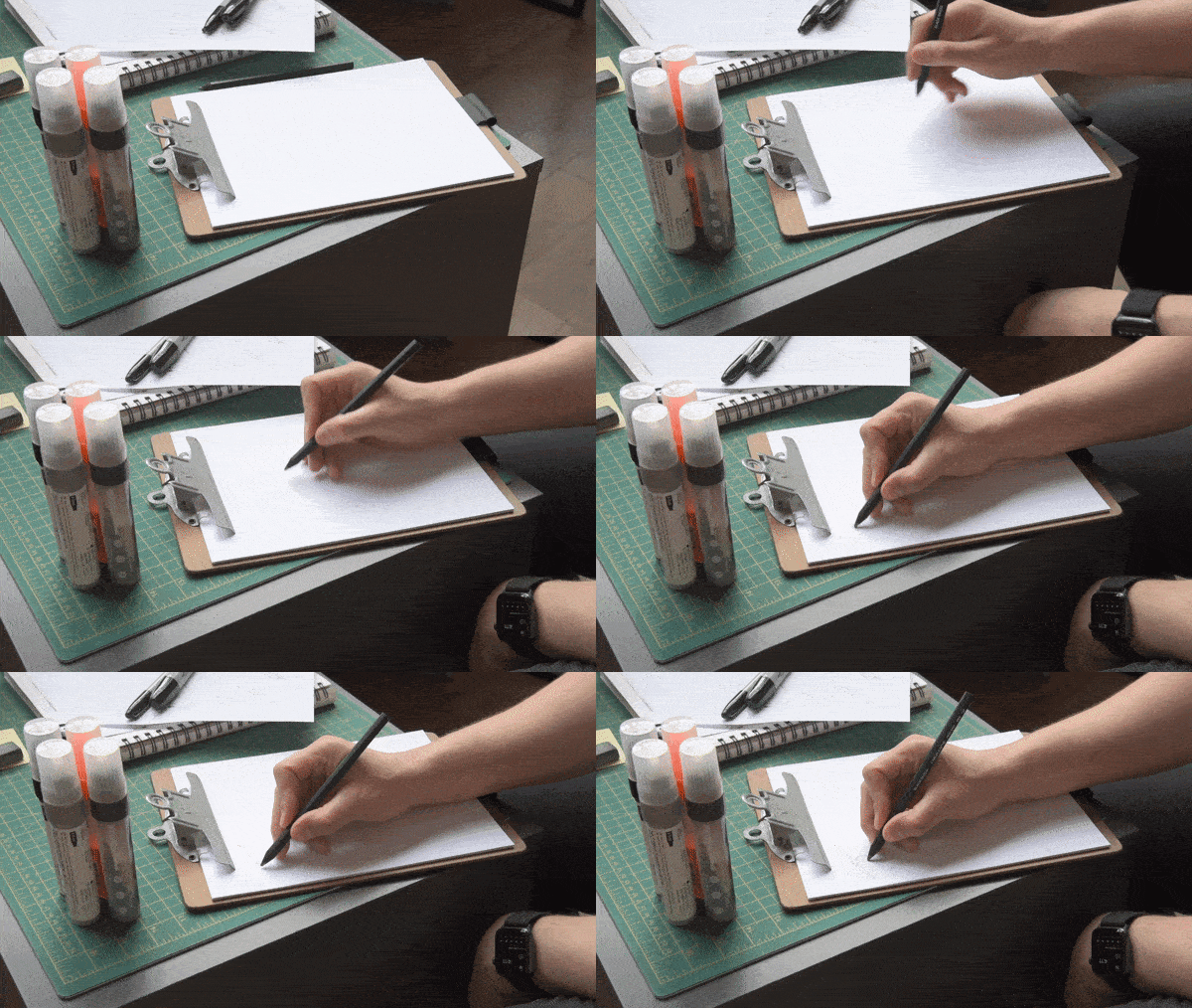
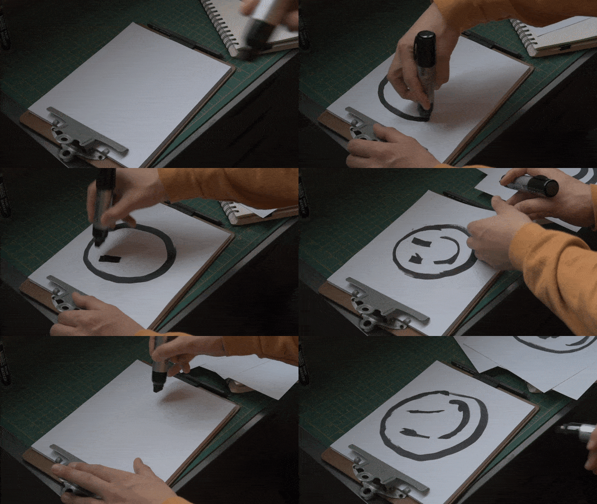
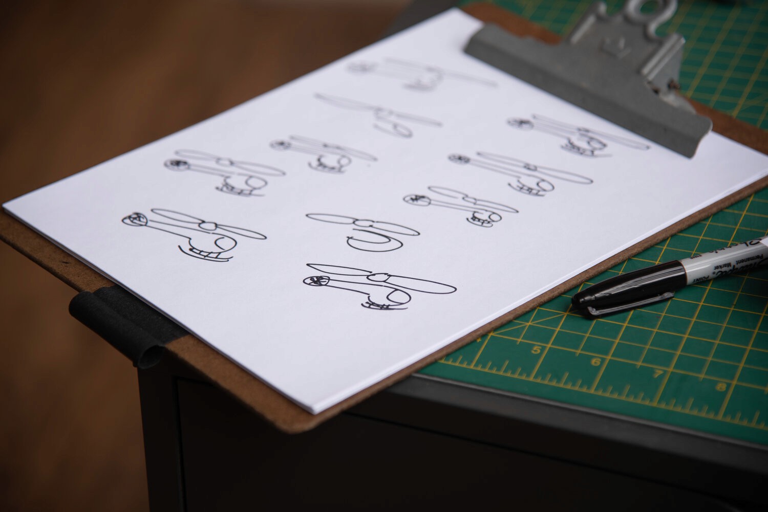
I started by sketching hand-drawn elements on paper, then integrated them digitally to add a personal touch and break the uniformity of digital design.
Digitizing from Paper
Once I was happy with the look of my hand-drawn elements, I brought them into my computer and animated some of them. This added movement and life, blending hand-drawn authenticity with digital animation to create a more dynamic and engaging design.
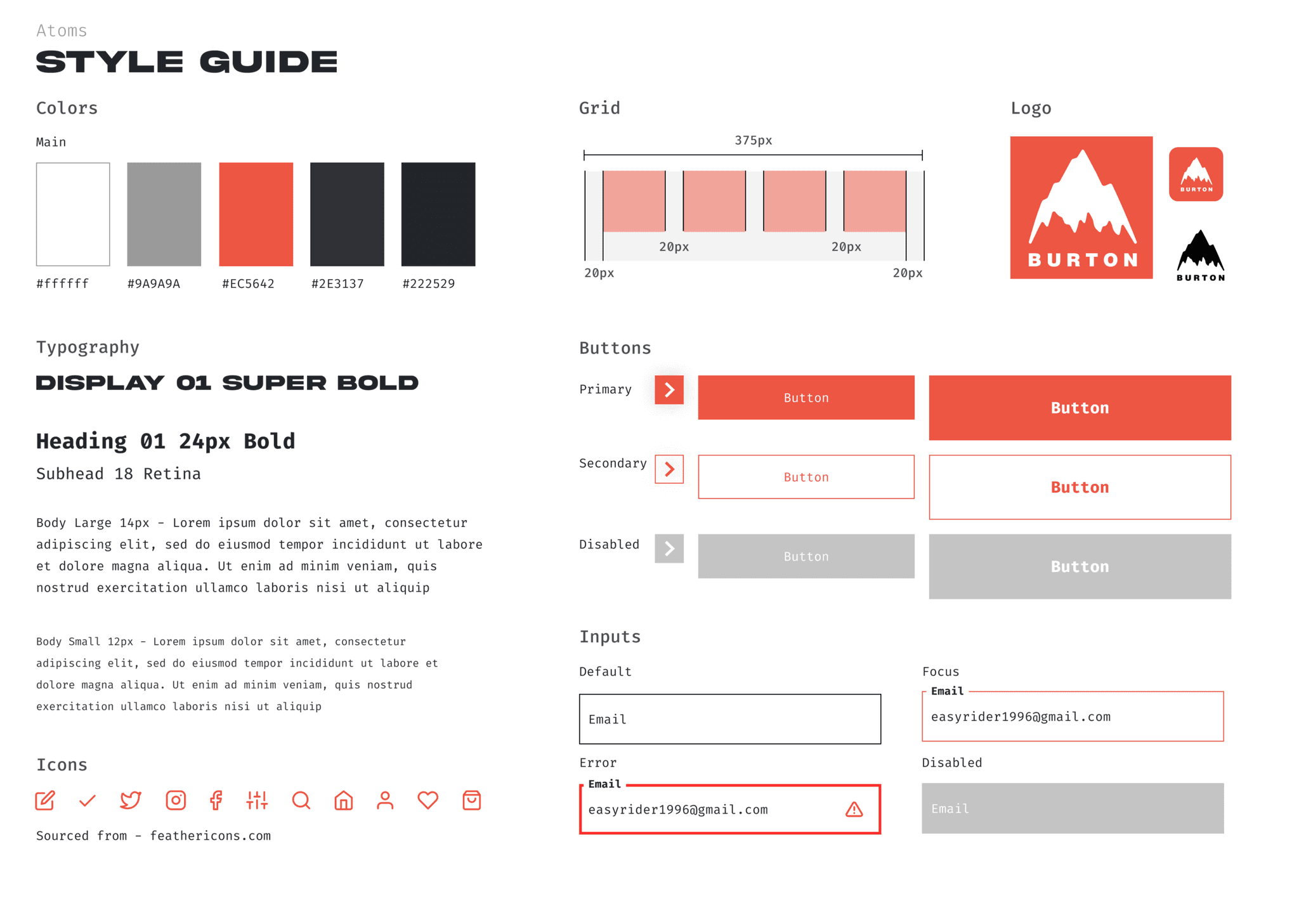
Creating a Style Guide
I created a style guide using mechanical elements to contrast the organic feel of the hand-drawn pieces. Pairing a bold display typeface with a monospaced font emphasized this contrast, balancing sharp geometry with fluid, hand-drawn designs for a cohesive yet dynamic visual system.
DELIVERABLES
The Outcome
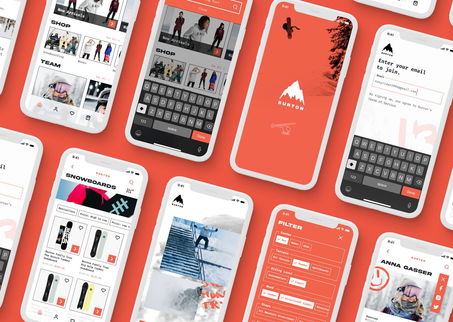
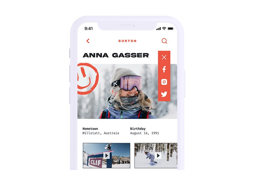
The result was a modern, bold mobile application that remained highly user-friendly. Users could perform all the website's functions, with the added benefit of social features. In this version, riders could share content, and based on the success of this feature, additional social capabilities would be developed over time.
Micro Interaction
Micro-interactions were carefully designed to provide users with clear feedback on their actions. These subtle animations enhanced the user experience by making interactions more intuitive and responsive, ensuring users understood the outcome of their actions.
Getting to MVP
In the initial MVP version, the concept allowed professional riders to post their own content, while users could create profiles to build their own social experience.
BURTON RETROSPECTIVE
The project successfully blended innovative design with user-focused features, resulting in a bold, modern app. We balanced usability with social elements, allowing users to engage and create profiles. The contrast between mechanical and hand-drawn elements, along with micro-interactions, added a unique touch. The MVP laid the groundwork for future growth, making the project both functional and creatively dynamic.
