RESEARCH/UX/UI FEATURE ENHANCEMENT
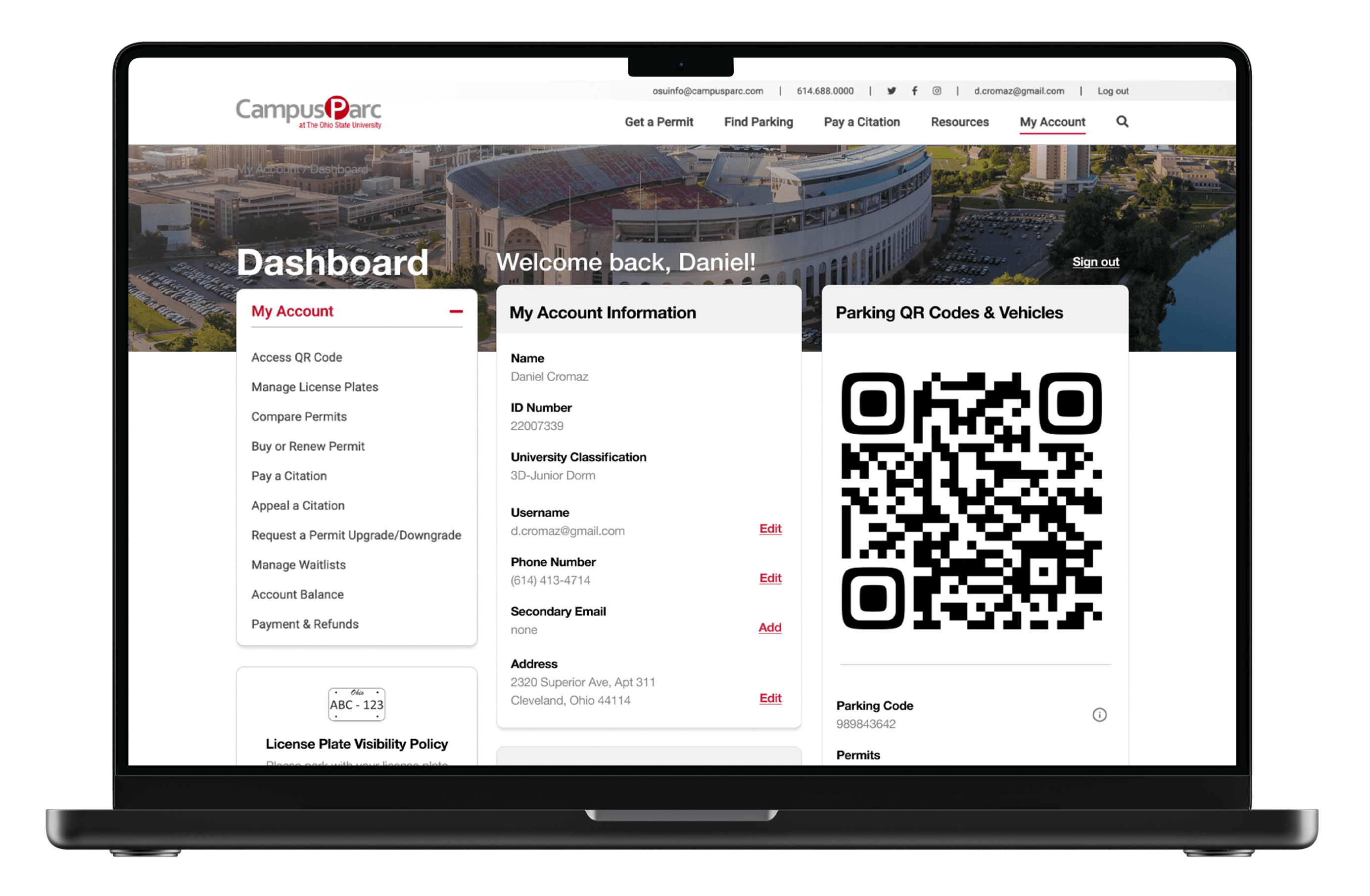
Feature enhancements designed to streamline sections of Ohio State University's parking experience.
Agency
Freelance
Roles
Senior UX Designer
Creative Director
Timeframe
Two Months
Team
Senior UX Designer
Product Manager
Development
CTO
Problem
CampusParc, the parking division of OSU, sought assistance in enhancing their account dashboard and permit comparison. They needed a more user-friendly and intuitive interface that would enable users to easily manage their accounts and compare parking permits. The objective was to significantly improve the overall user experience, making it simpler and more efficient for users to navigate the system and understand their parking options.
Solution
To improve these experiences, I leveraged survey data, user interviews, and usability testing to identify key issues. The surveys highlighted common pain points, while interviews provided deeper insights into user challenges. Usability testing further revealed areas for enhancement. By integrating this feedback, I implemented targeted improvements, creating a more streamlined and user-friendly experience.
RESEARCH
I started the process with research by conducting a site survey to identify key user issues. The survey results guided the focus of user interviews and usability testing, helping to confirm and explore the specific challenges. This ensured that the design improvements were directly aligned with user needs.
Site Survey
The site survey revealed significant frustration and confusion with the compare experience, highlighting several key pain points that needed to be addressed. The survey allowed the user to rate several aspects of the experience and enter their own responses to improve it.
68.5% of ~3000 users rated the experience a 3/5 or below.
Most frequent fill-in responses mentioned a severe lack of clarity.
A large amount of users did not want to dig deeply into the site for their answers.
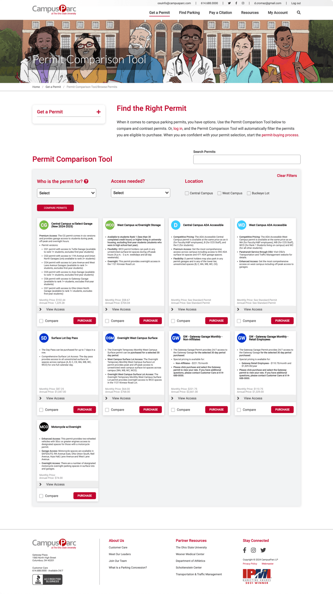
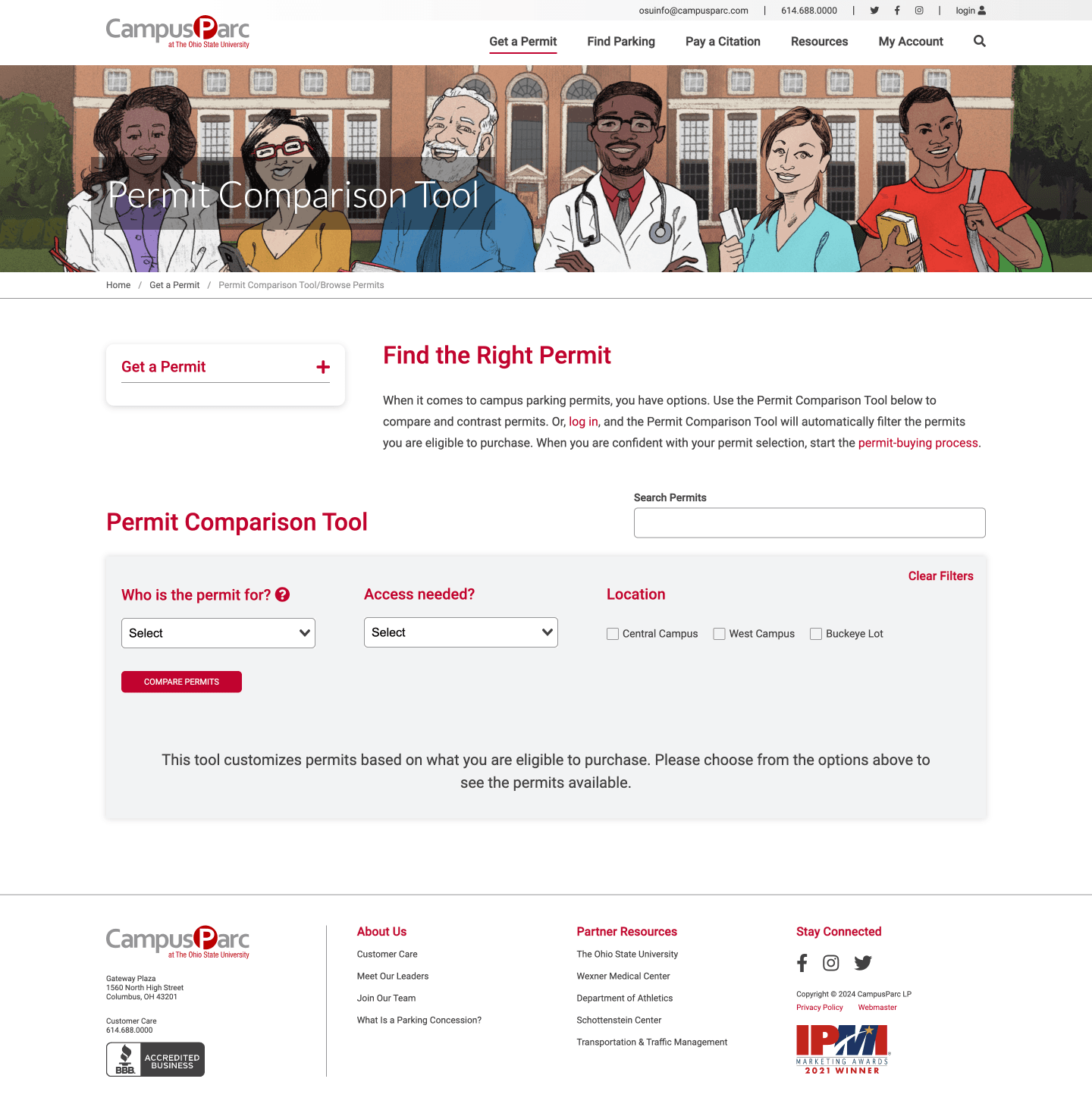
Before - The previous, single-page version of the permit comparison tool.
User Interviews &
User Testing
I created a script consisting of various unbiased tasks and questions based on information pulled from the survey. Next, I conducted several user interviews and tests remotely with students and employees. These are various quotes from actual test users showing frustration in various areas of the my account and compare pages.
Della - Student
"I don't really have a way of knowing because it doesn't have like a button that tells me what was filtered out. I think it looks the same"
Tyler - Student
“I haven't found the definition on this page yet of peak and off peak, but I know there's, like, usually the working hours are peak, and then off peak is, like, after five or six or whatever. So I'd have to find it on this site somewhere.”
Jim - Employee
"Maybe a map somewhere. Maybe you could click on a map, and then this would be green, this would be purple."
Justine - Student
"Okay, see, there's not really anything that shows me that these are available to me."
A snippet of video from a remote user test I conducted.
Main Insights
My Account Page
After reviewing the research for the My Account page, it was found that the page was difficult to read and scan, with several sections that users either didn’t understand or found unnecessary.
Permit Comparison Tool
After reviewing the survey, interviews, and user testing, the main pain points in the Permit Comparison Tool were information overload, confusion around terminology, and a lack of overall clarity.
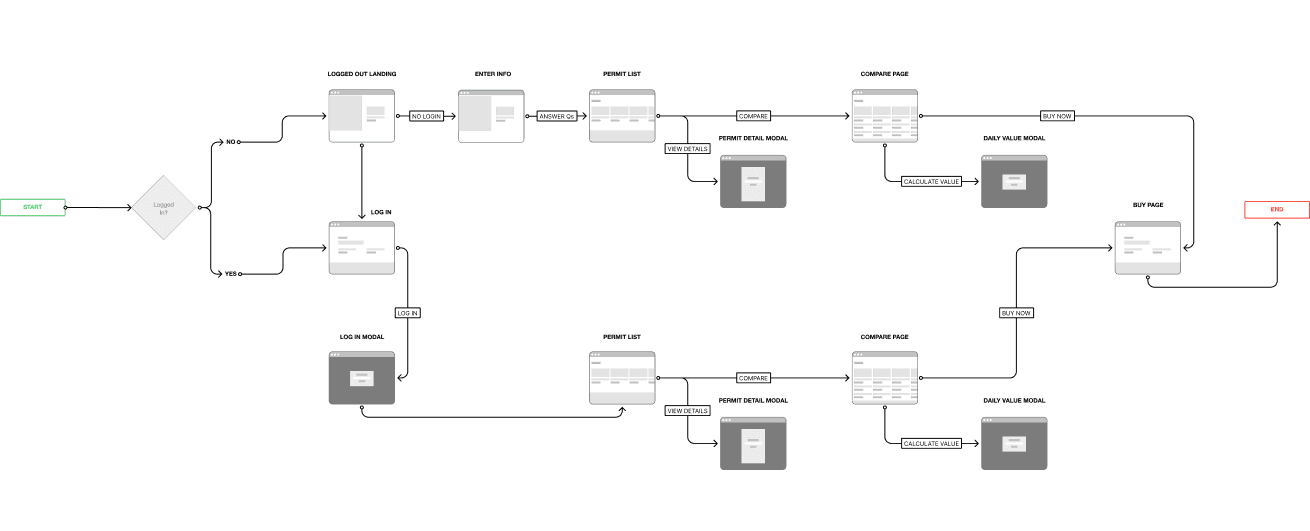
USER FLOW
While the My Account page was a single screen, the Permit Comparison Tool required a more in-depth approach as I was transitioning it to progressive disclosure. I began by creating a user flow to map out how users would navigate through the new experience, ensuring a smoother and more intuitive process.
WIREFRAMING
After updating the user flow, I started sketching and wireframing the new screens. During this process, I ideated while using the established research as a guiding principle, ensuring that my designs remained aligned with user needs and the project's objectives.
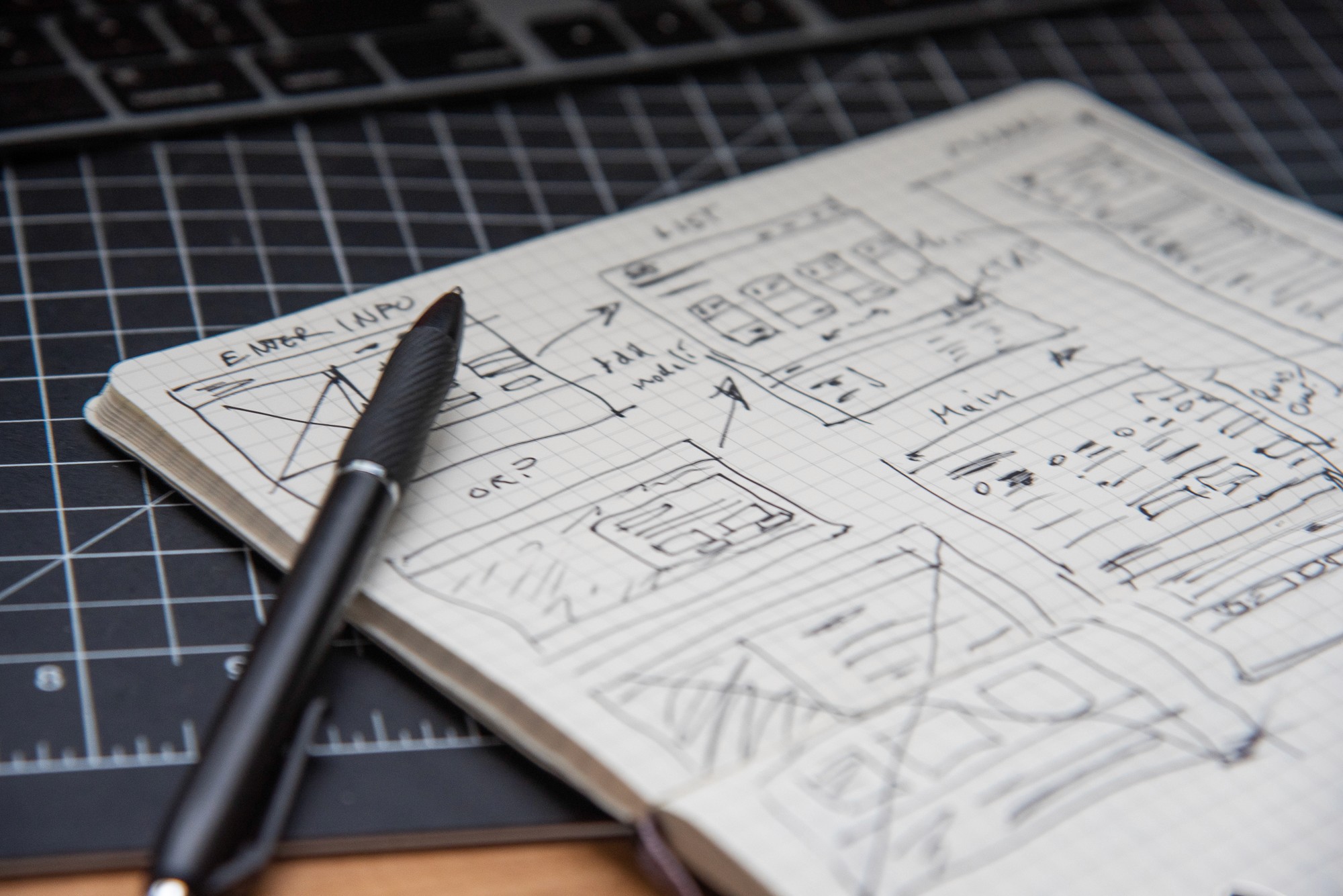
Sketching
While the user flow guided the layout, ensuring a logical and intuitive progression, sketches allowed me to quickly visualize the design, make early adjustments, and establish a strong foundation for next steps.
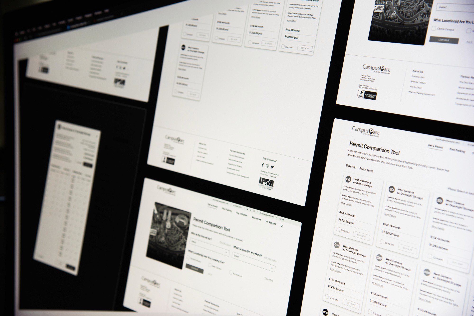
Wireframing
The next step was wireframing, where I refined the sketches into detailed layouts. During this phase, I continued to ideate, exploring different ways to enhance usability and functionality. Wireframing allowed me to test the structure and ensure that key elements were well-placed, setting a solid foundation before moving into high-fidelity design.
HIFI DESIGN & PROTOTYPING
Concept Testing
After screens were worked out (based on modifying the current site styles) and moved to high fidelity, prototypes were built then tested. Key insights from the testing led to the addition of sticky footers to keep the main CTAs visible, especially on small screens, and ensuring that the primary call to action in the compare experience was always to buy, even when users were navigating through comparisons.
DELIVERABLES
My Account Deliverables
After completing the design process, I prepared annotated deliverables for the development team. These included detailed design specs, high-fidelity mockups, and interactive prototypes, with annotations explaining functionality and design intent. This promised a smooth handoff and maintain the design's integrity.
Before & After
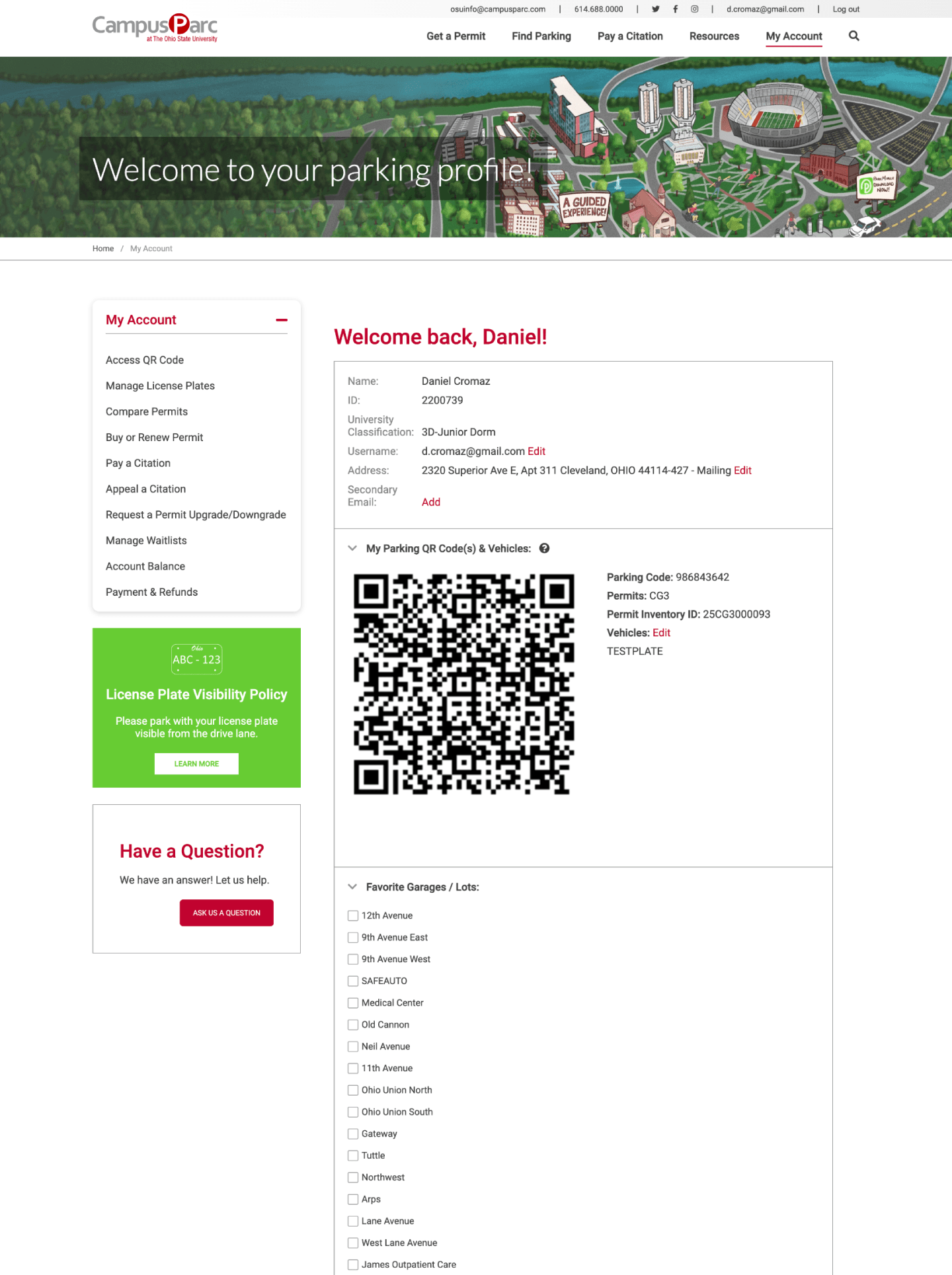
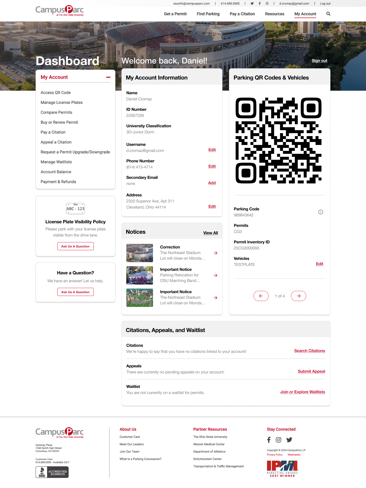
Before the redesign, the My Account page was hard to navigate and confusing for users. After the redesign, it became more intuitive and user-friendly, with a clearer layout and improved readability.
Before
After
Removing & Consolidating
I removed unnecessary content and consolidated elements. This made the page more focused and easier to navigate, allowing users to find key information quickly and manage their accounts more efficiently.
Simple Hierarchy Improvements
I improved the page by making simple hierarchy adjustments, such as using red exclusively for CTAs. This clarified the visual structure, drawing attention to important actions and making it easier for users to navigate and interact with the page.
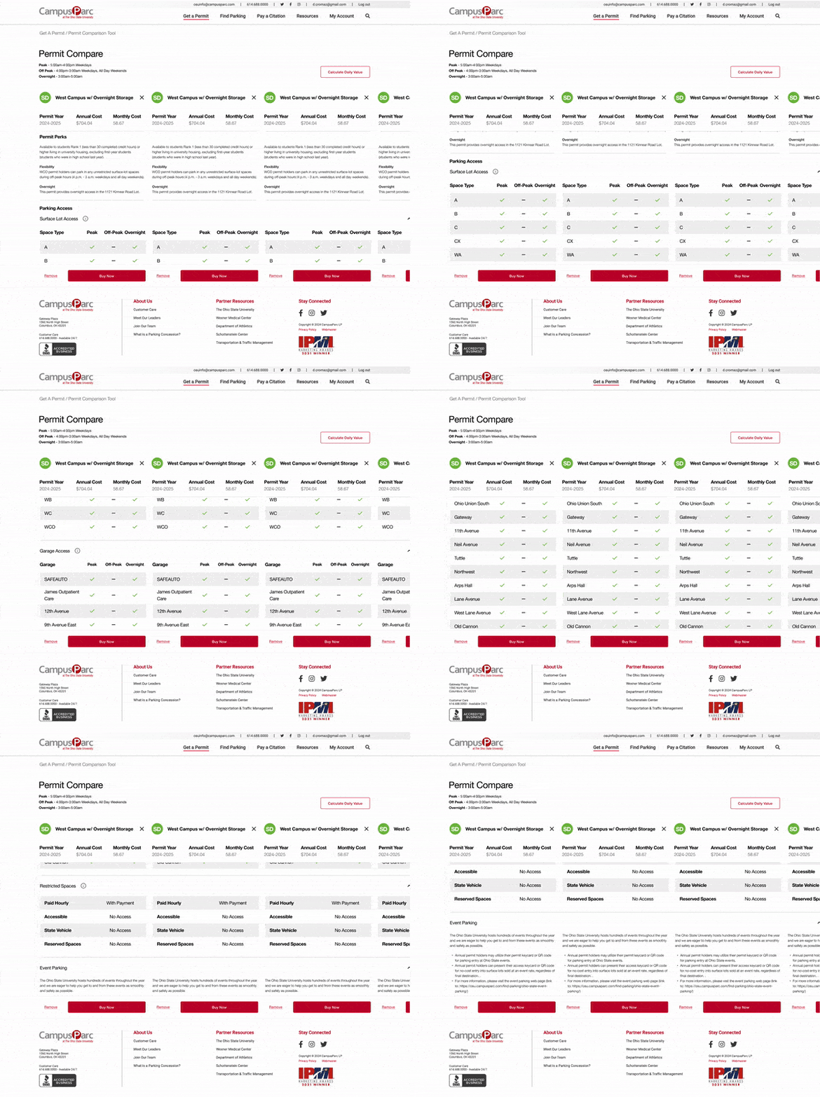
After completing the design for the Permit Comparison Tool, I created a comprehensive set of deliverables for the development team. This package included user flows, screen flows, detailed design specs, high-fidelity mockups, and interactive prototypes. Each deliverable was carefully annotated to clarify functionality and design intent, ensuring a smooth transition from design to development while preserving the core user experience.
Permit Compare Landing
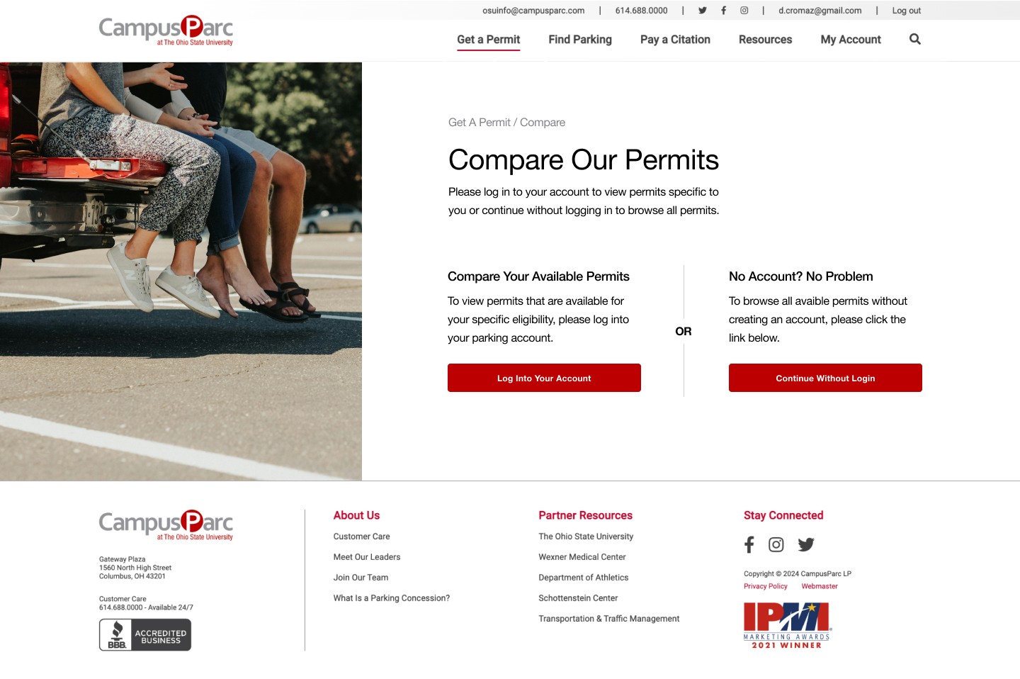
To avoid overwhelming the user, the single-page permit comparison experience was broken up into manageable sections, beginning with a streamlined landing page. This approach guided users step-by-step through the comparison process, making it easier to digest information and make informed decisions.
Before - Users had difficulty understanding that once authenticated, eligible permits would automatically populate.
After - My first step was to prompt the user to log in if they chose to or proceed without.
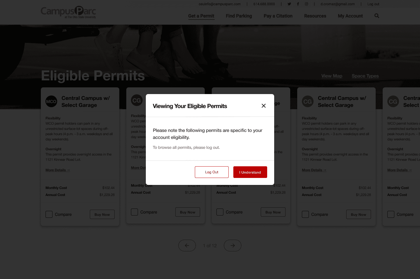
After - To ensure users understood they were only seeing eligible permits I added a confirmation modal after they successfully logged in.
Quick Questionnaire
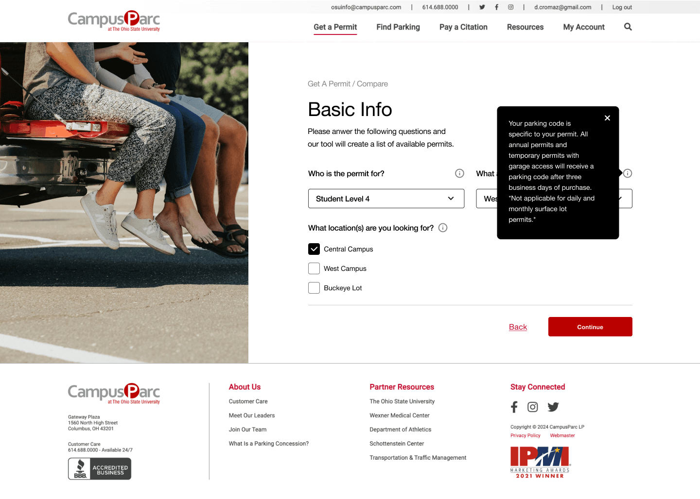
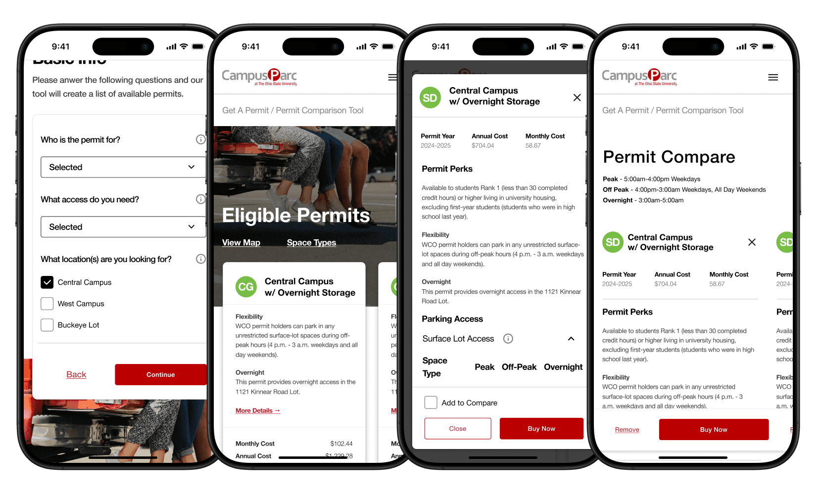
The next step was to complete a short questionnaire that included explanations of key terms, helping users better understand their options. However, if the user had already logged in, they could skip this step, as the system would automatically tailor the available permits to their specific eligibility.
Testing revealed that users did not understand several terms, so tooltips were added to clarify anything unclear.
Permit List Page
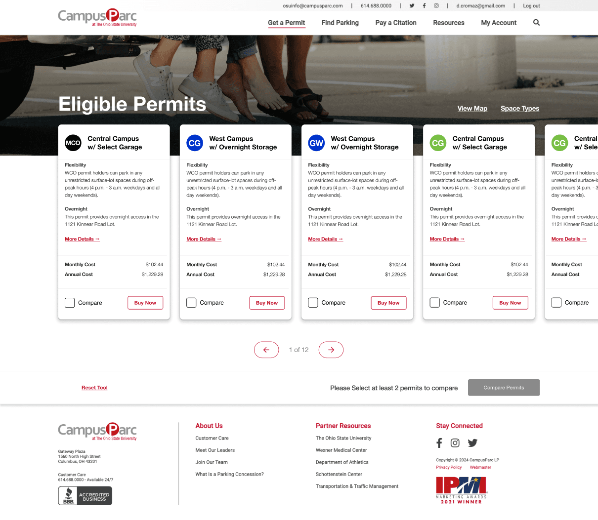
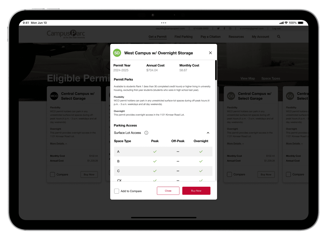
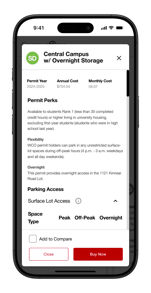
The next step was the permit list page, which populated permits based on user eligibility or questionnaire answers. In addition to a new card design and layout, a new modal was created to display permit details more effectively, making it easier for users to review and compare their options.
Compare
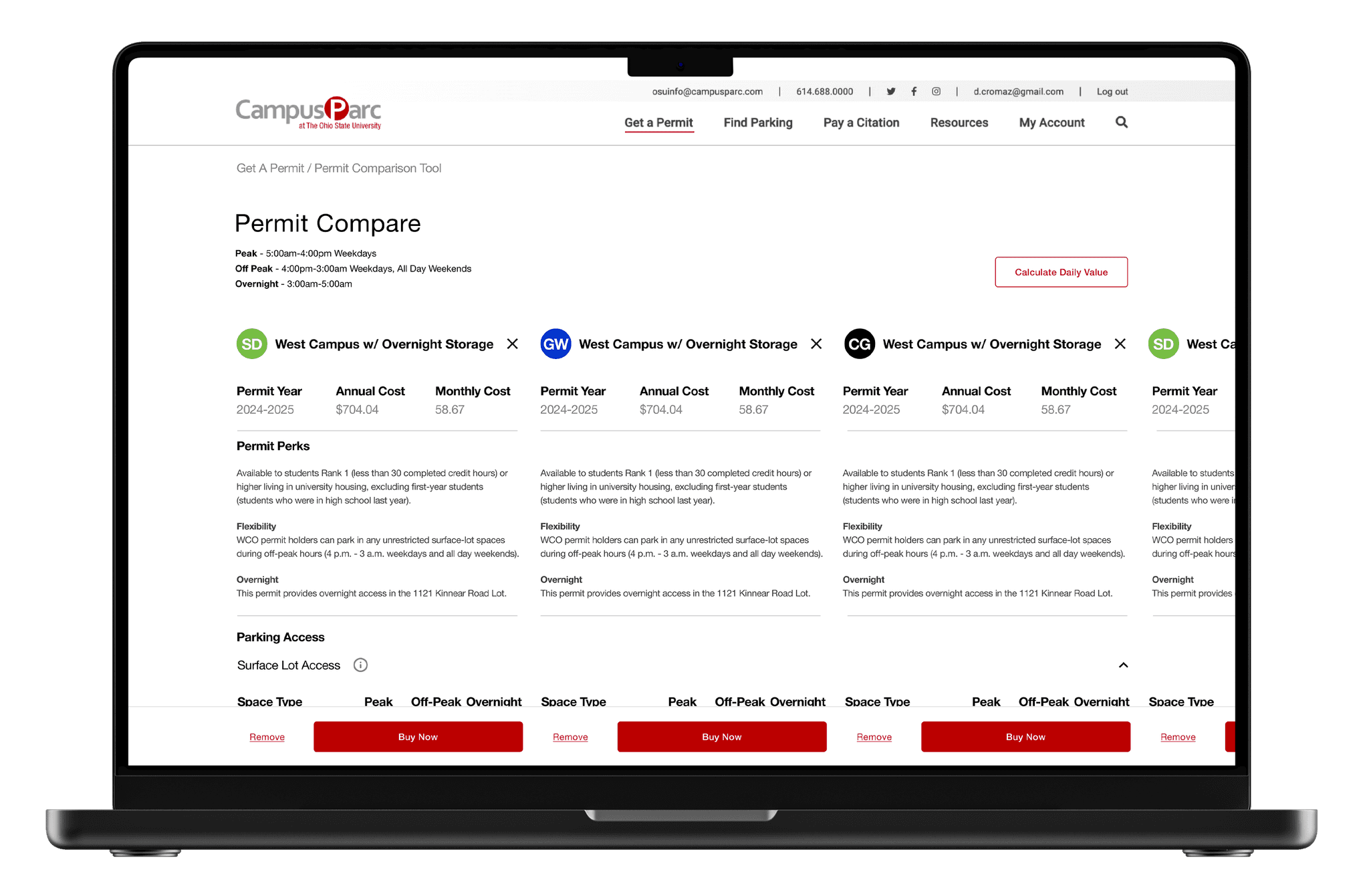
Once the user selects two or more permits, they can compare them side by side. A sticky footer was implemented to keep CTAs visible, along with accordions and both horizontal and vertical scrolling to ensure the comparison details are easily accessible.
OSU RETROSPECTIVE
By simplifying and clarifying the experiences, the My Account and Permit Comparison Tool pages were greatly improved. The process focused on addressing user pain points through research, design iterations, and testing. Features like streamlined layouts, tooltips, and sticky footers made the experiences more intuitive and user-friendly, leading to a more effective final design.
